Catching flowers: a journey into bronze casting
by Nele Bergmans // December 2022
This flower I like
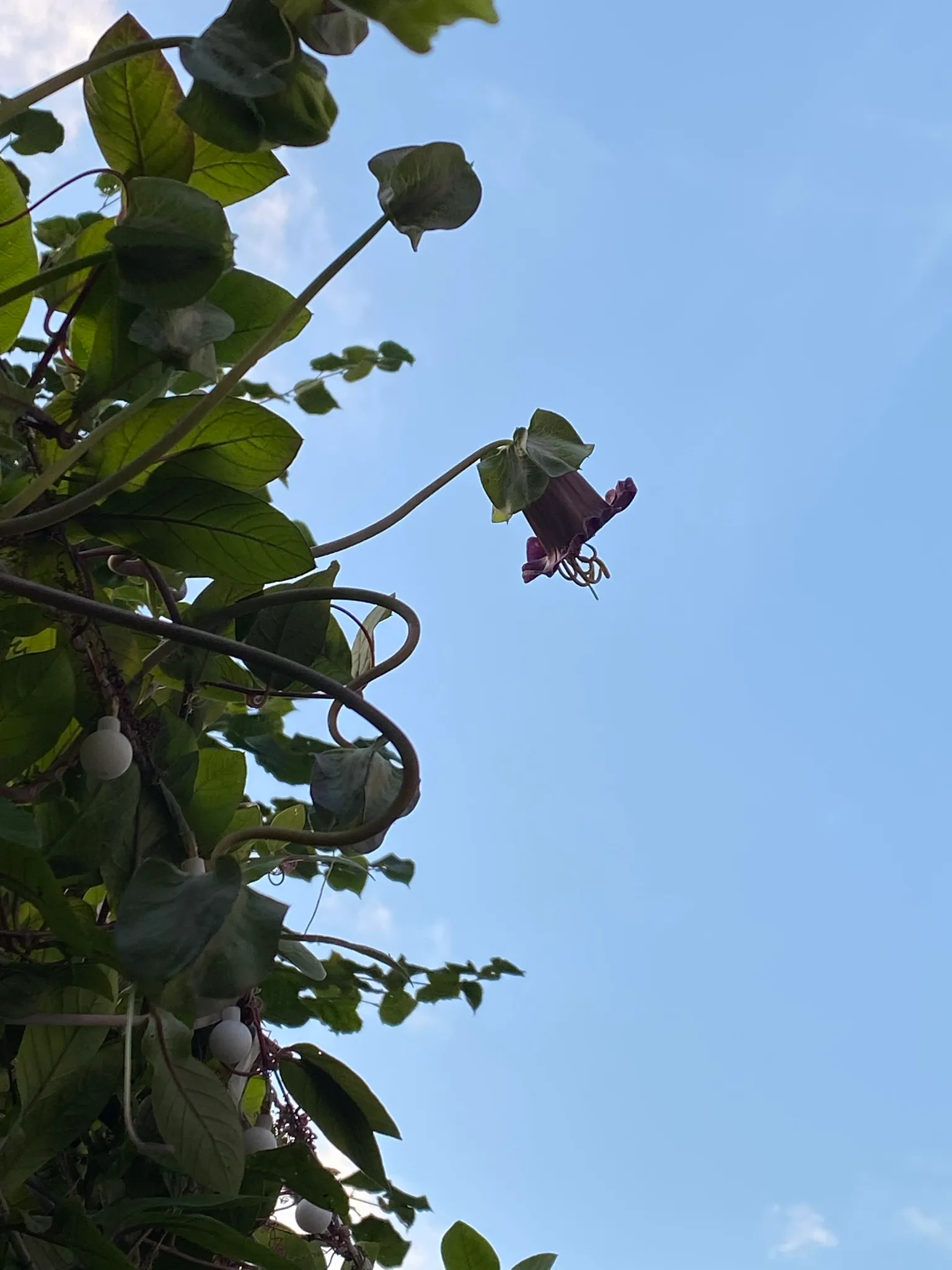
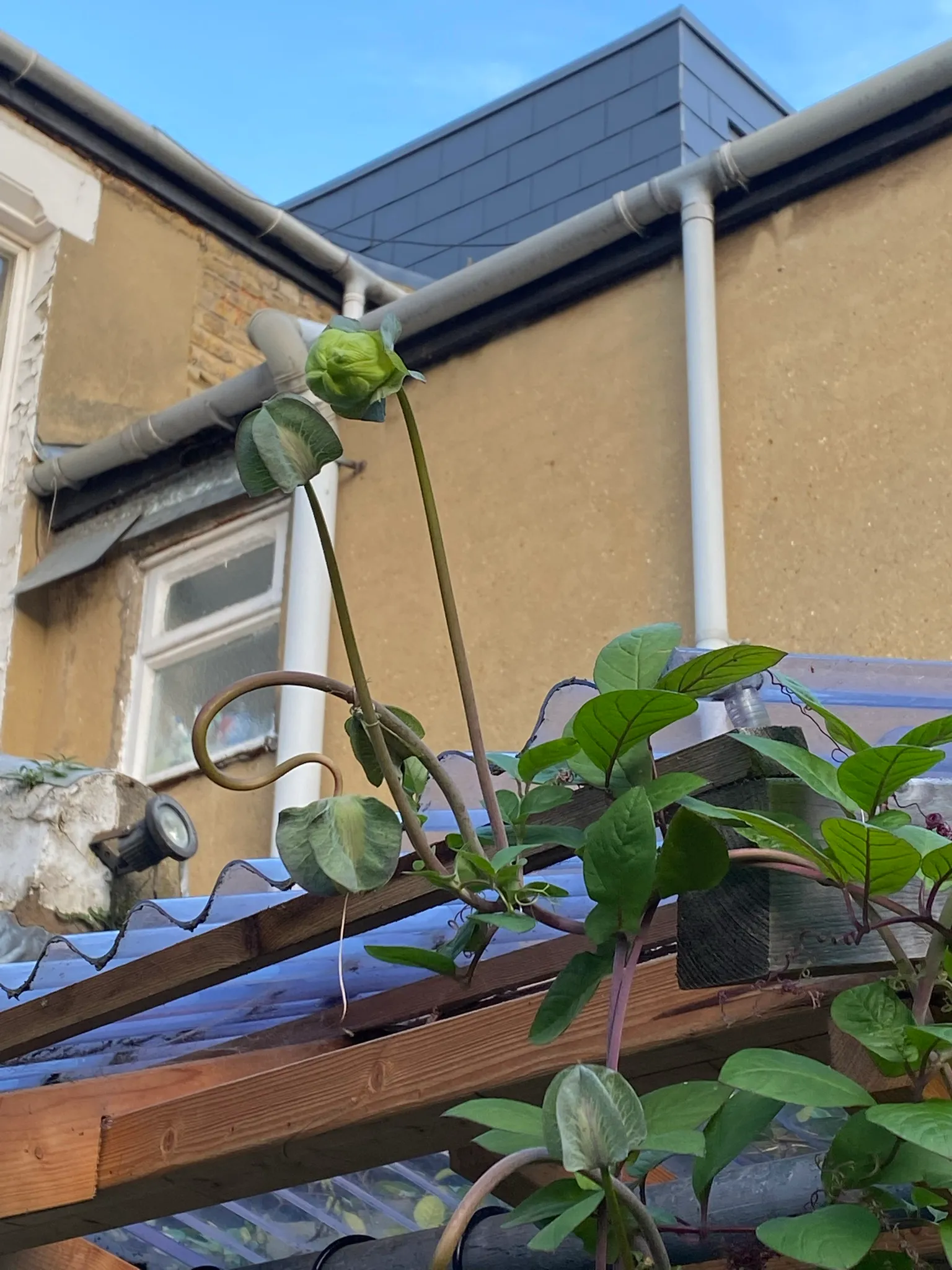
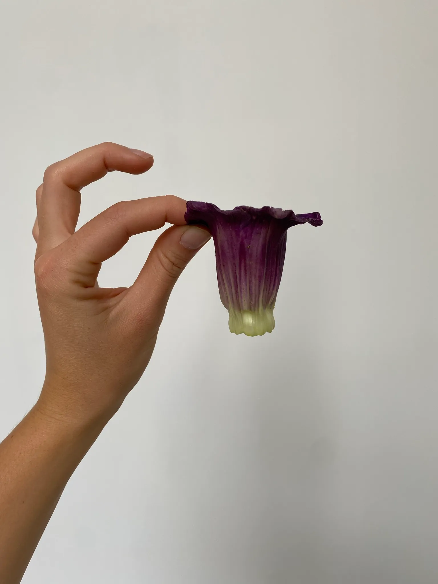
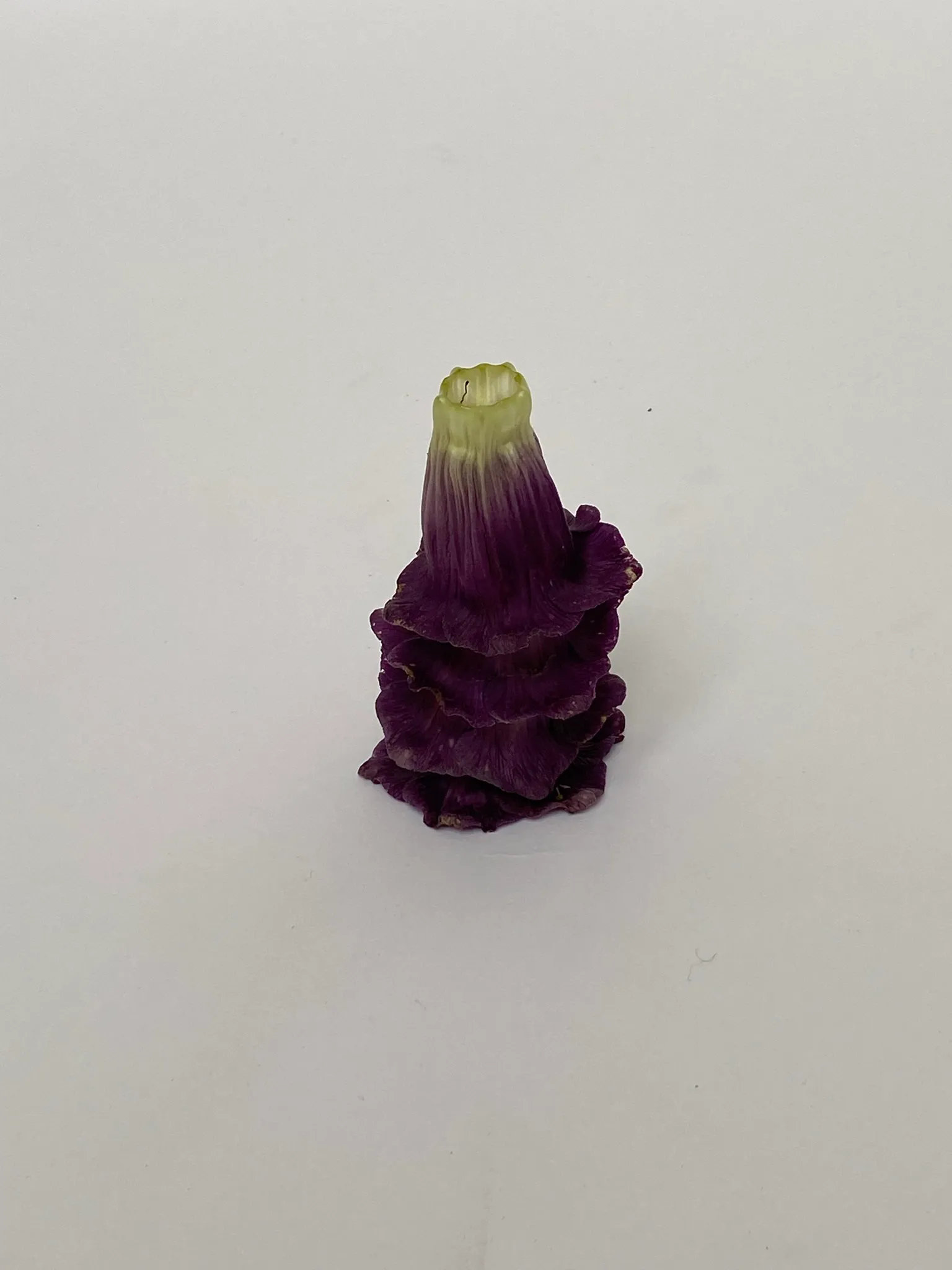
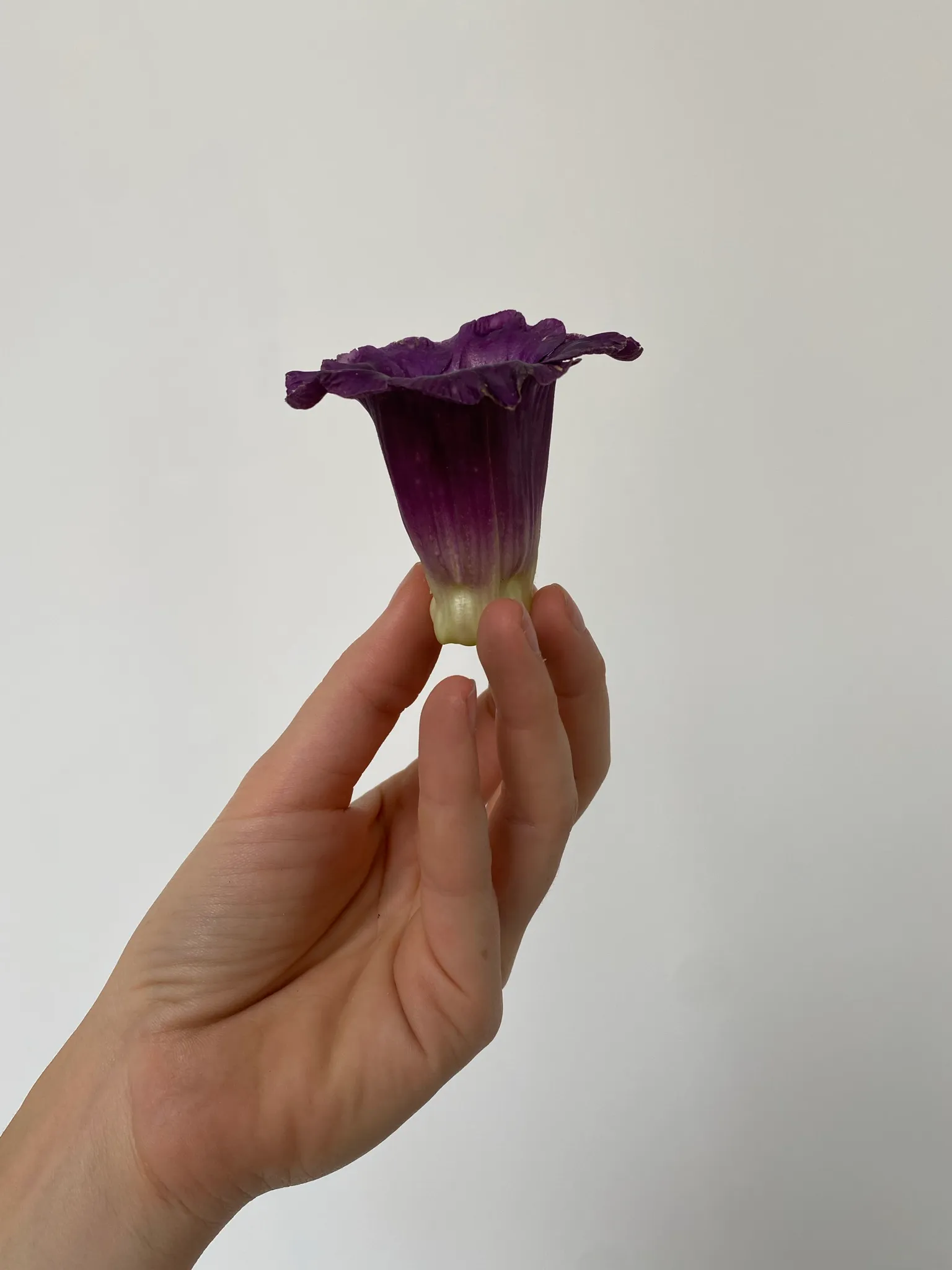
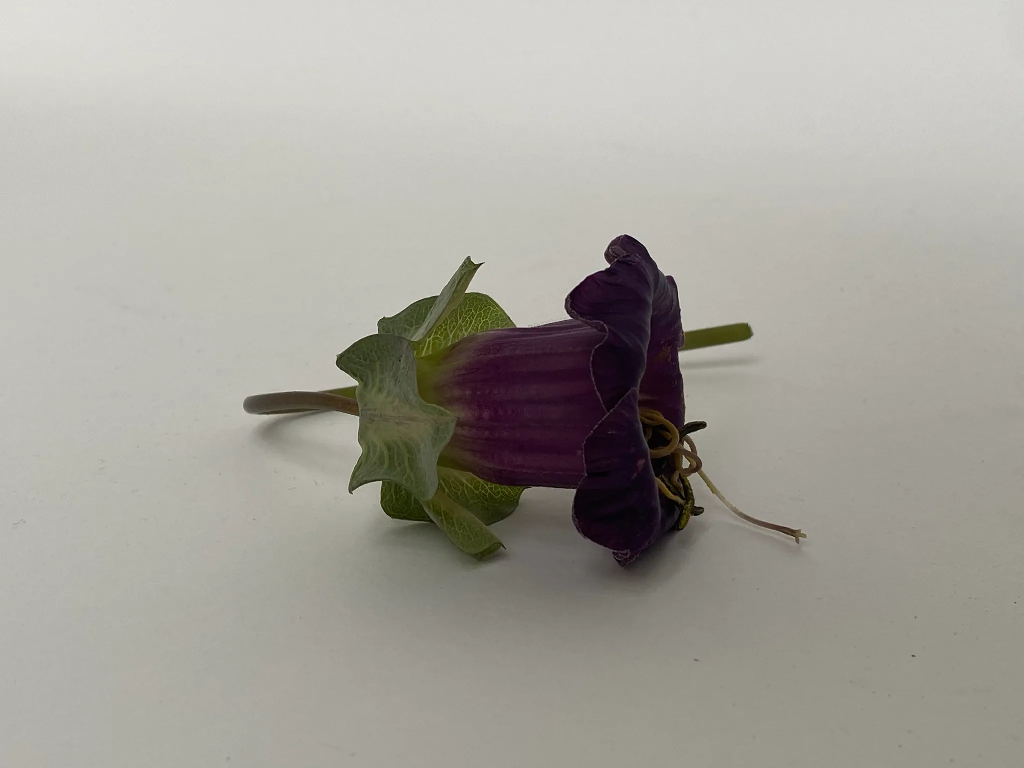
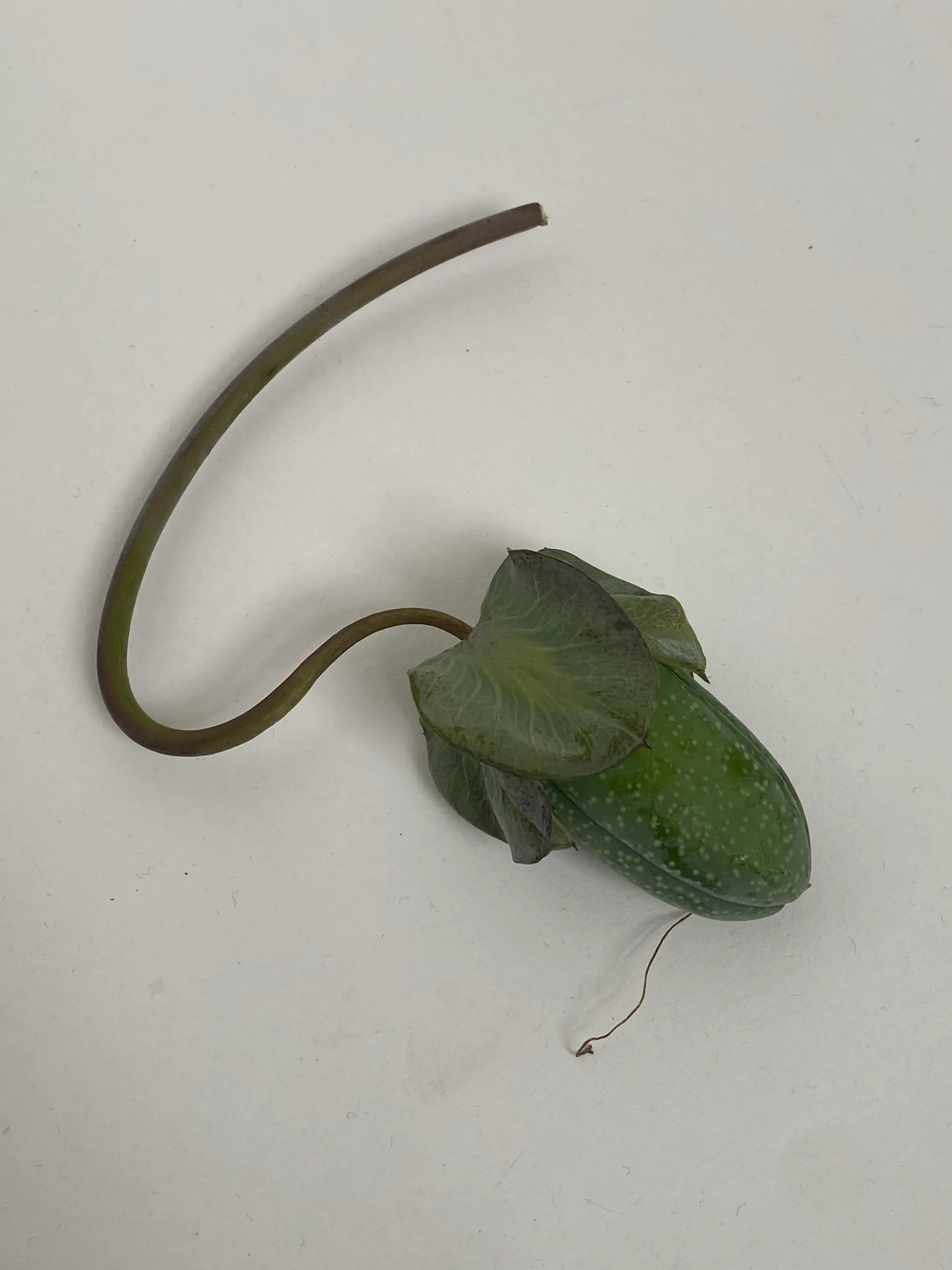
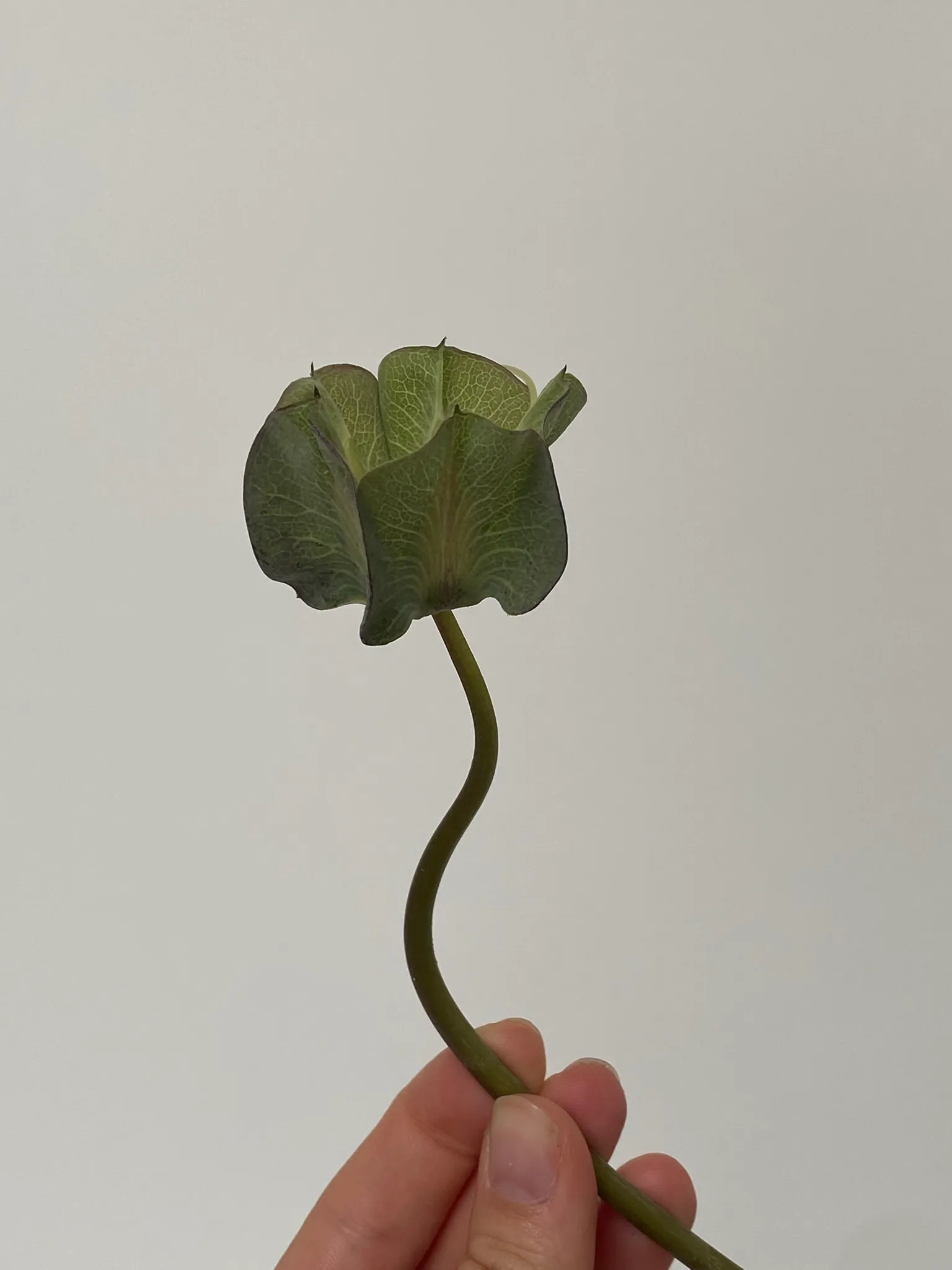
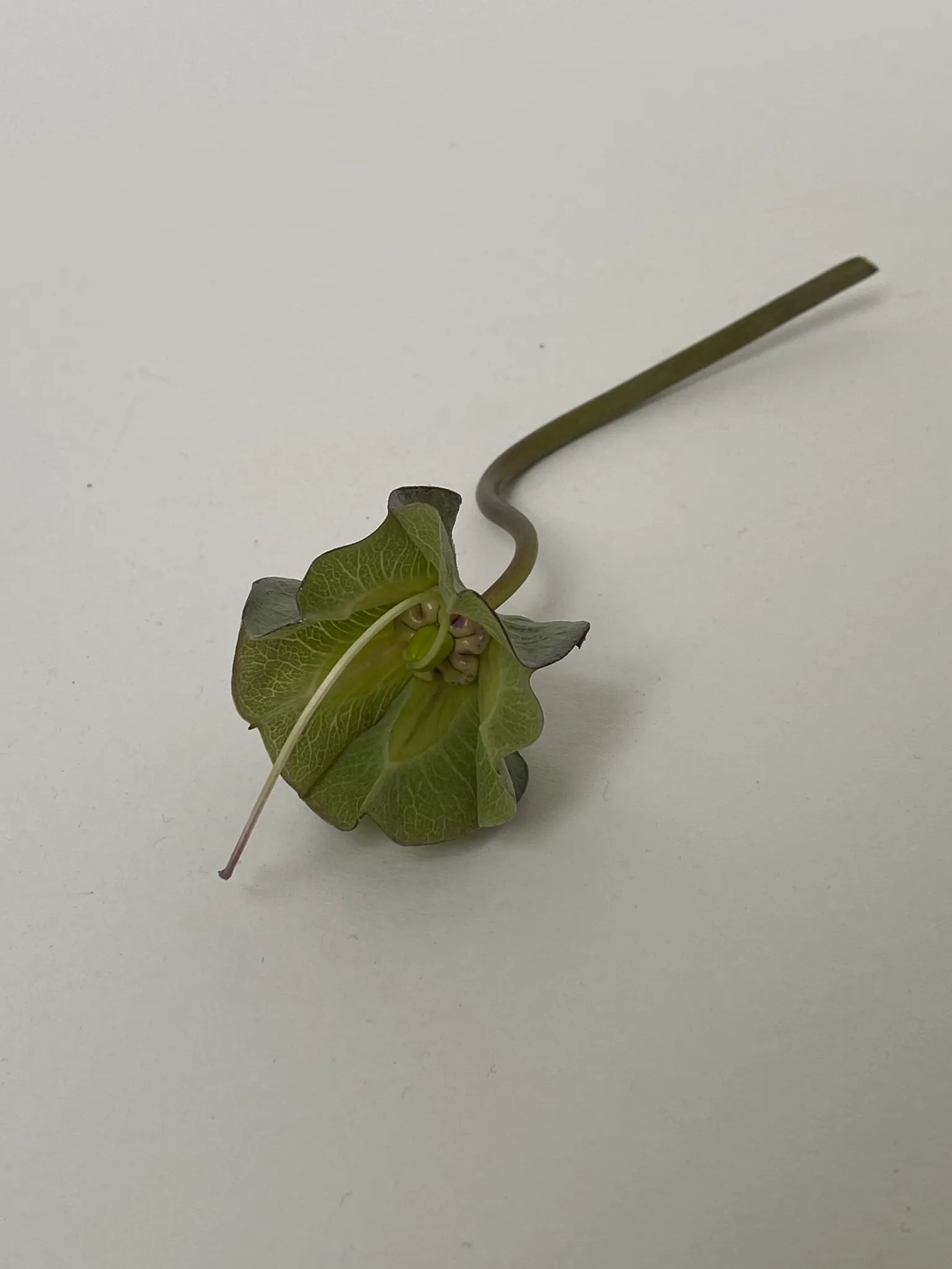
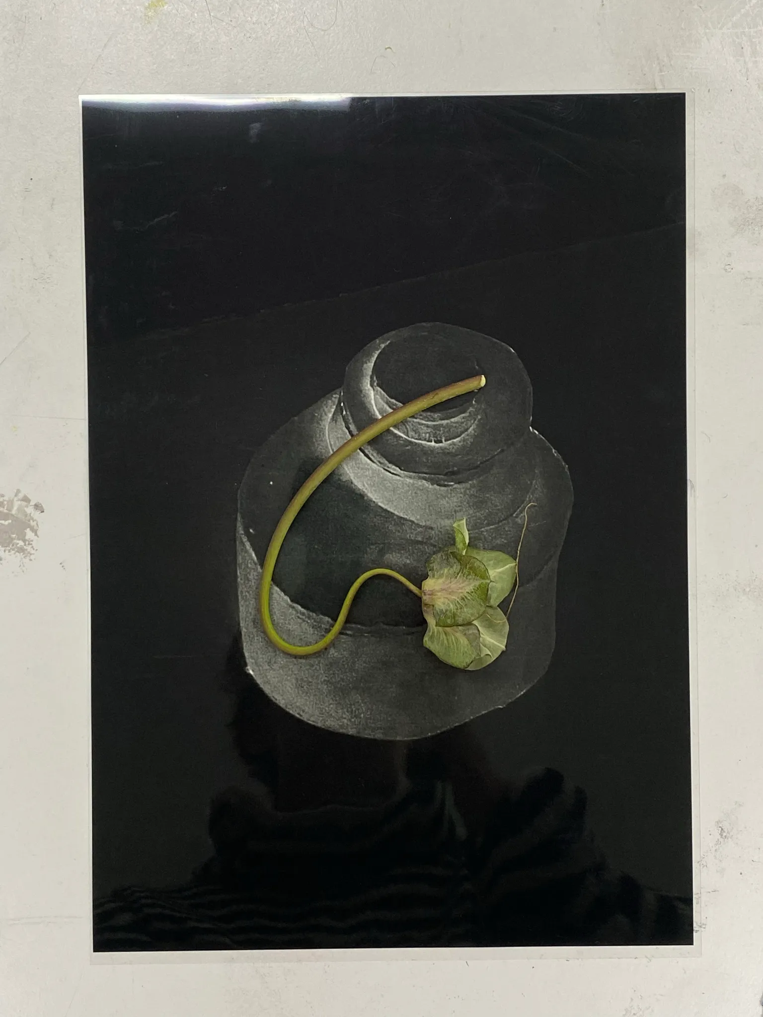
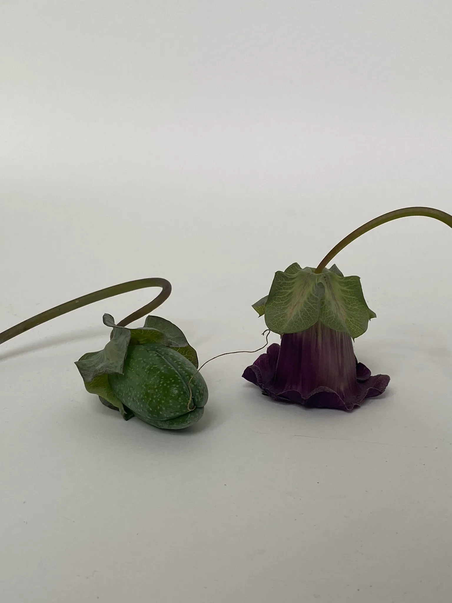
Recently I have moved house. Previously we had a lush, deep, green garden with a variety of plants and flowers, and big fig tree that would provide us with figs in autumn. In the new house, we still have a garden, although tiny. There is mainly only one plant growing. It’s a climbing plant, neatly organised around wires in the air, forming a canopy that provides us with privacy from the blocks of flats around us. One morning, having breakfast in the kitchen, my gaze got drawn to this plant. More specifically, to the flowers that had fallen on the floor. They were purple, with a light green top. Steady, very sculptural flowers, that once fallen, stood fiercely upright on the floor. Their shape so particular, it seemed they were waiting to be picked up and used for something else. They grow in the air, when they are still in their fruit, the flowers are heavy and hang down. Once they are ready to bloom, they slowly creep upright, trying to catch the sun, and open up. First greenish, almost colourless, a purple starts to kick in after a while, reaching its peak intensity when the flower is fully unfurled.
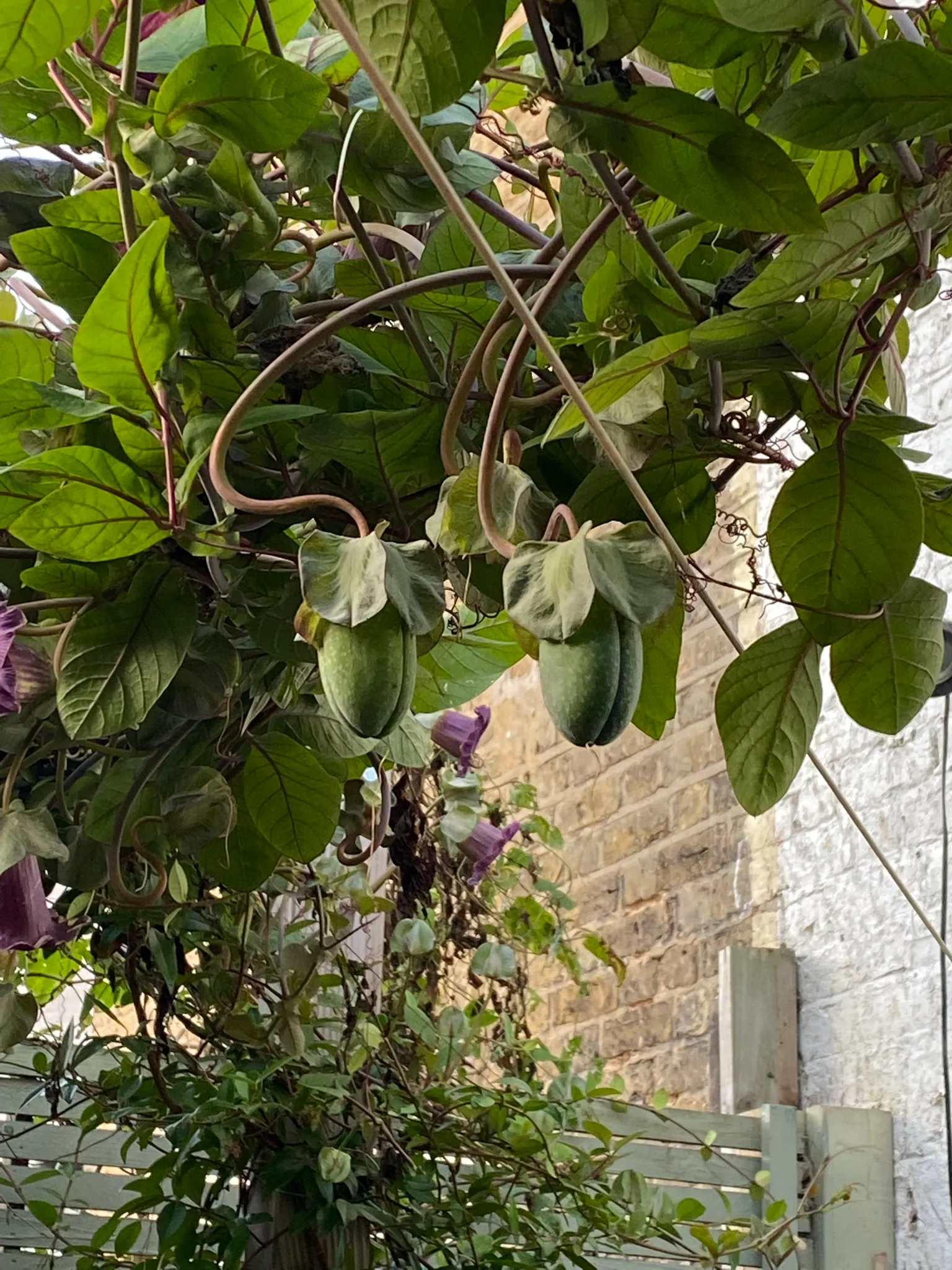
Being quite mesmerised by this flower, it’s shape and colours as well as its life, I decided I wanted to catch something of this beauty. A journey into mould making began.
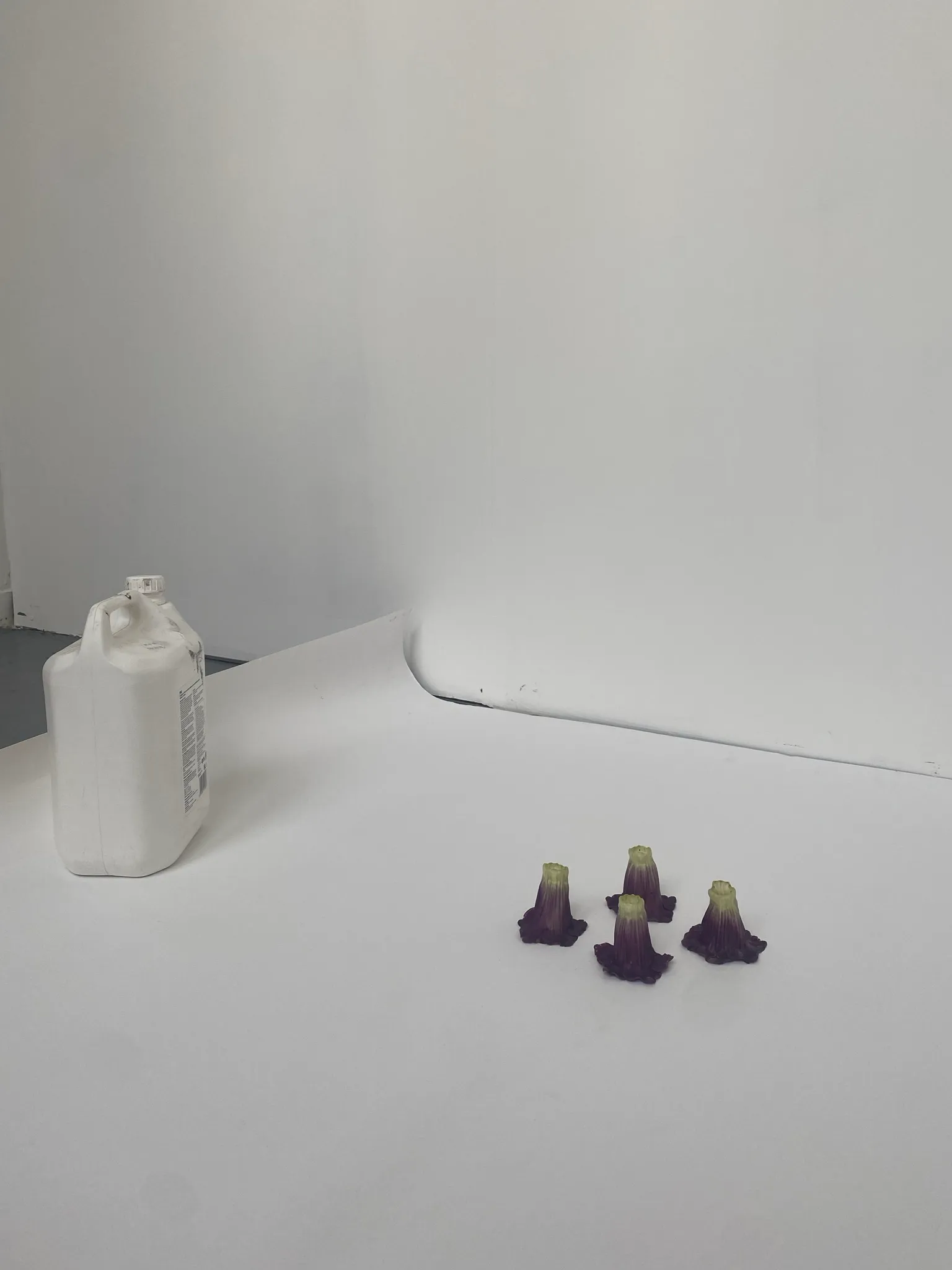
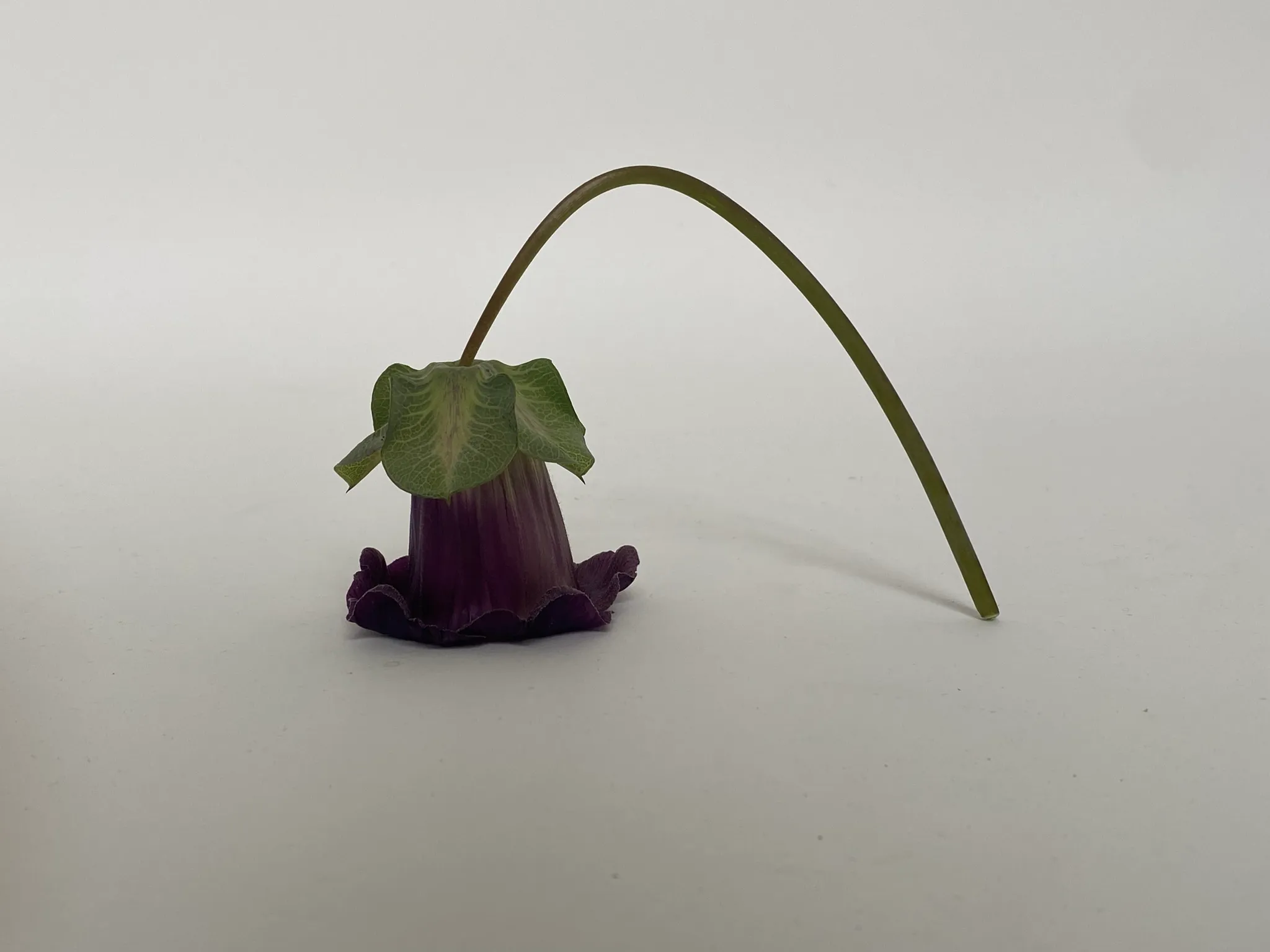
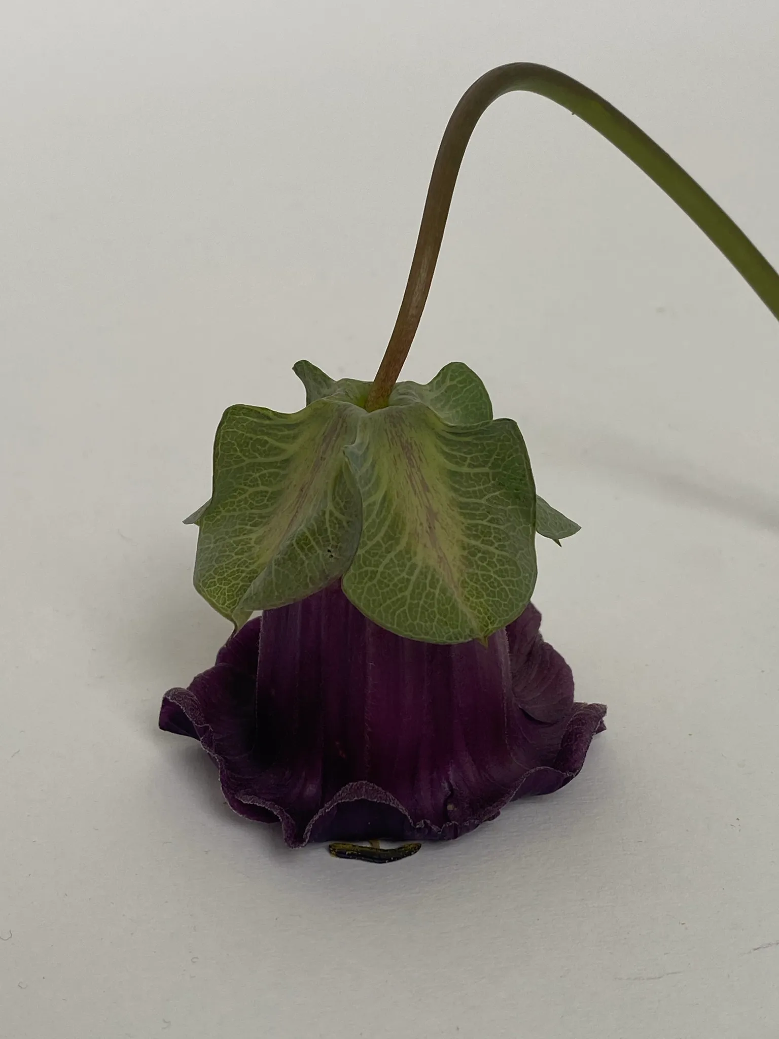
A thing I do quite often when I’m drawn to an object, is to isolate it and take photographs from different angles. For me, this allows me to sense if there is more potential for this object. Looking at it, quite attentively, from different angles and in different compositions, fuels my senses and makes my creative brain jump and imagine possibilities. Basically, this is play. But it’s also a decontextualisation, or recontextualisation, allowing new meanings/connotations in.
Making a mould
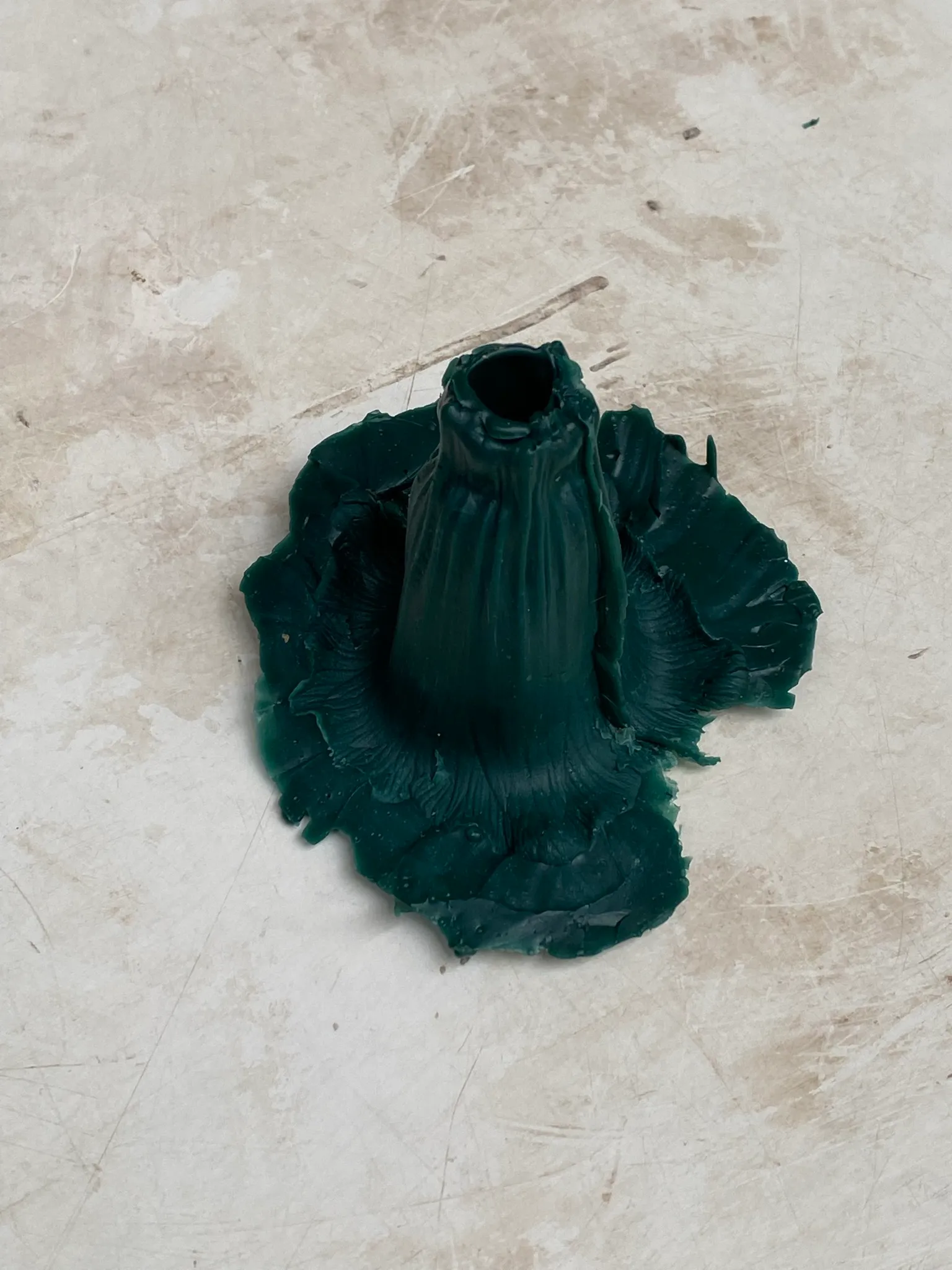
I ended up in the foundry, as I was told slipcasting with slip (liquid clay) would lose detail. I thought it would be nice to cast them in aluminium, as I find it a light, etheal material, and it fits the delicateness and fragility of the flower.I used silicone to make the mould. As it’s poured cold, can take a lot of detail, and the drying speed can be controlled with extenders, it seemed appropriate for the delicate flower. My first attempt, I poured the silicone in one go and too quickly, which made the flower collapse under the weight of the silicone. I ended up with crooked flowers. They have something as well, something humble, but they didn’t really contain this sculptural quality and fierceness that I liked so much within the fresh flowers.
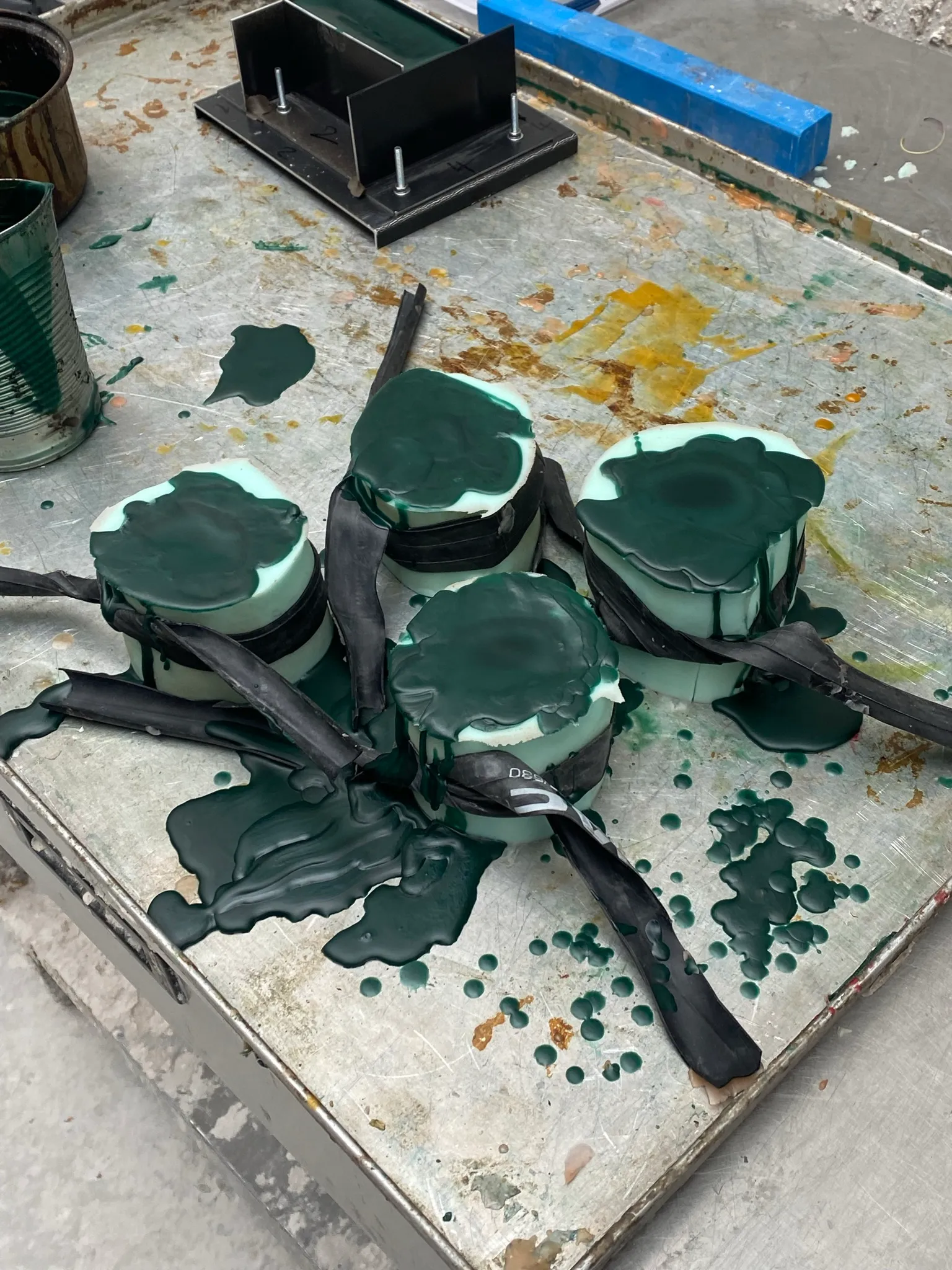
My first attempt, I poured the silicone in one go and too quickly, which made the flower collapse under the weight of the silicone. I ended up with crooked flowers. They have something as well, something humble, but they didn’t really contain this sculptural quality and fierceness that I liked so much within the fresh flowers.Second attempt I poured the mould in parts and poured inside as well. This resulted in a very succesful mould. However, since the flower itself is so thin, I couldn’t pour the wax inside of the mould. I could chose between brushing the wax inside the outer part of the mould, which gave me the texture on the outside, or on top of the internal part, which would give me the texture of the inside of the flower.
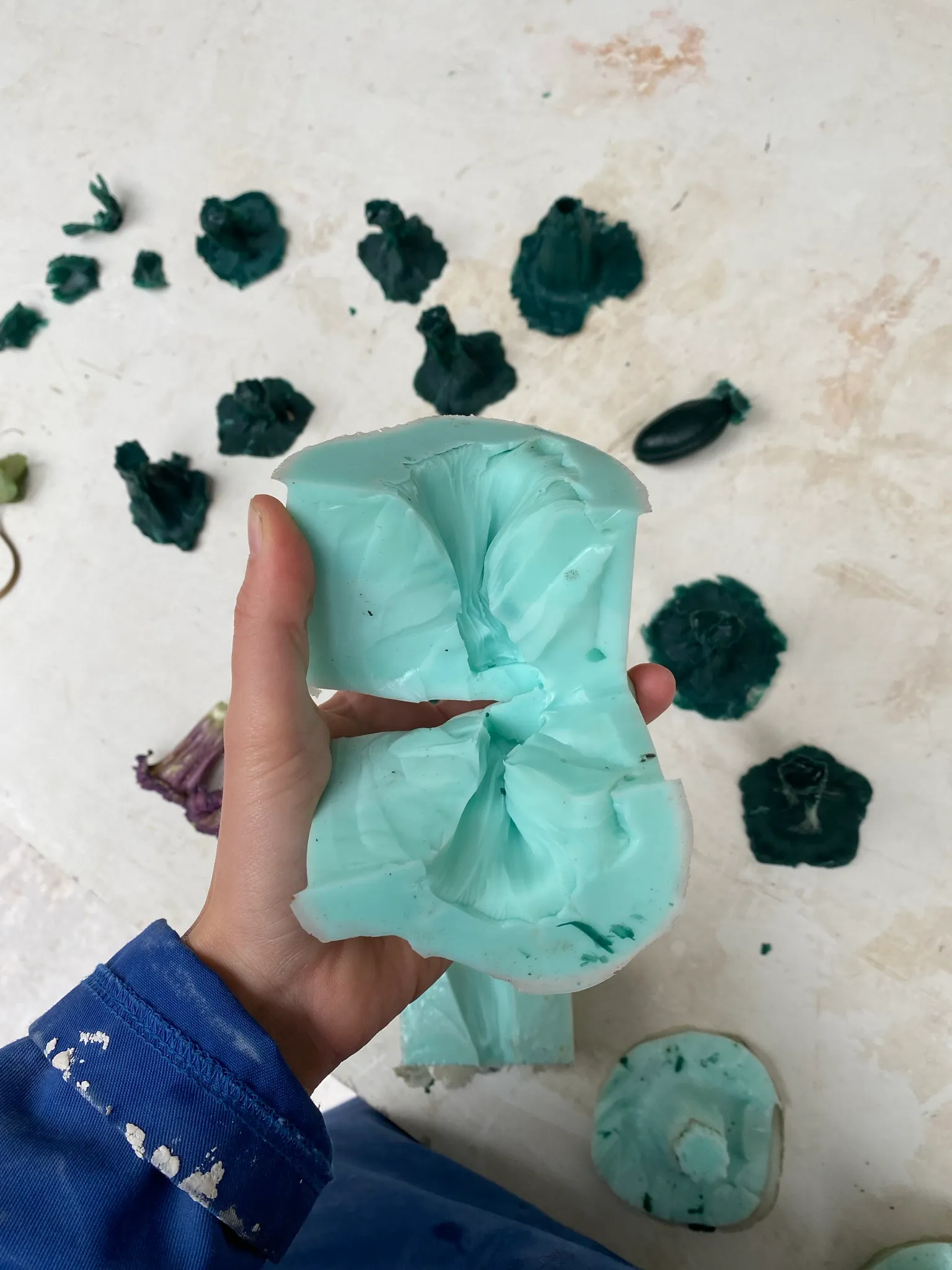
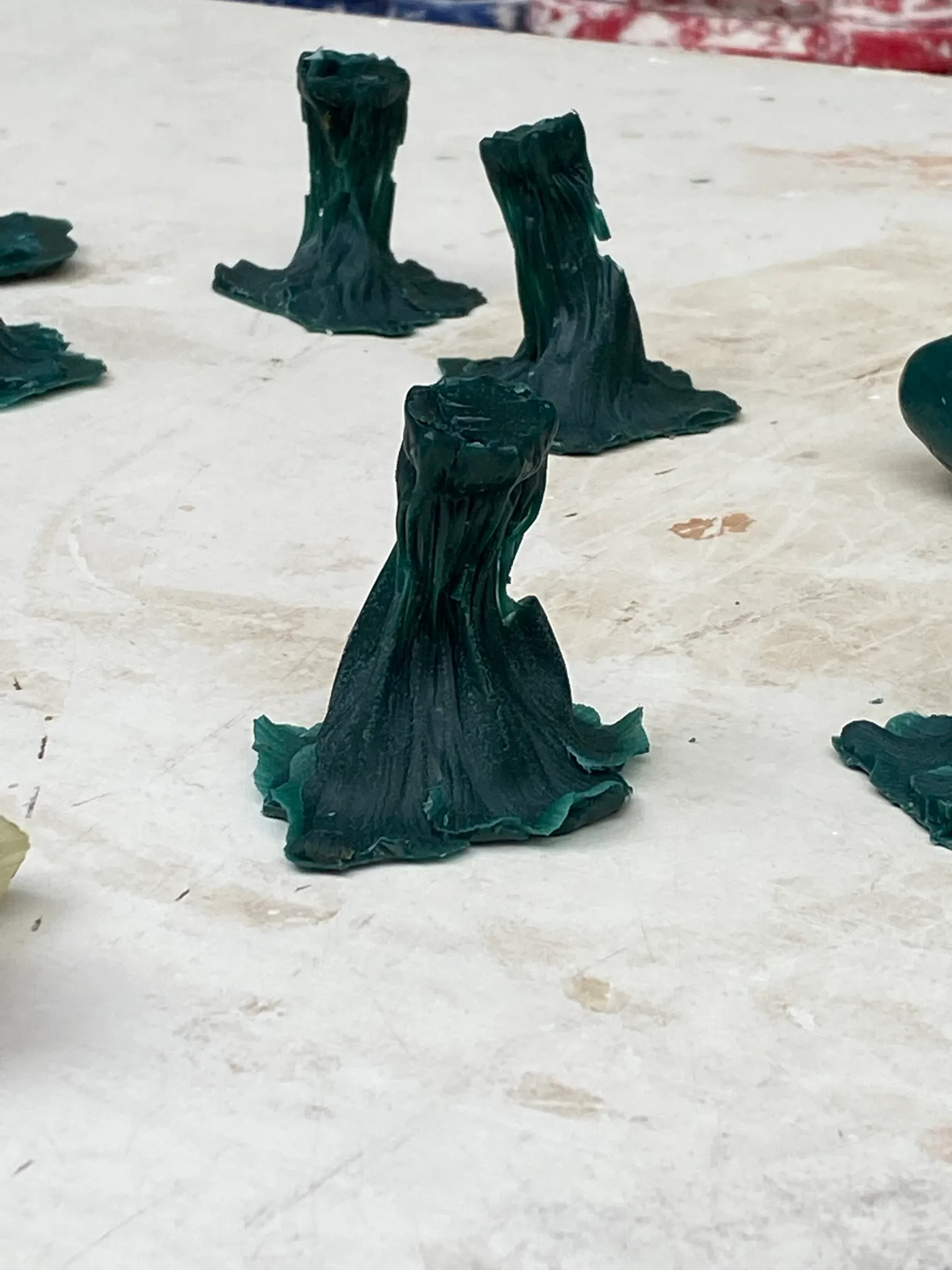
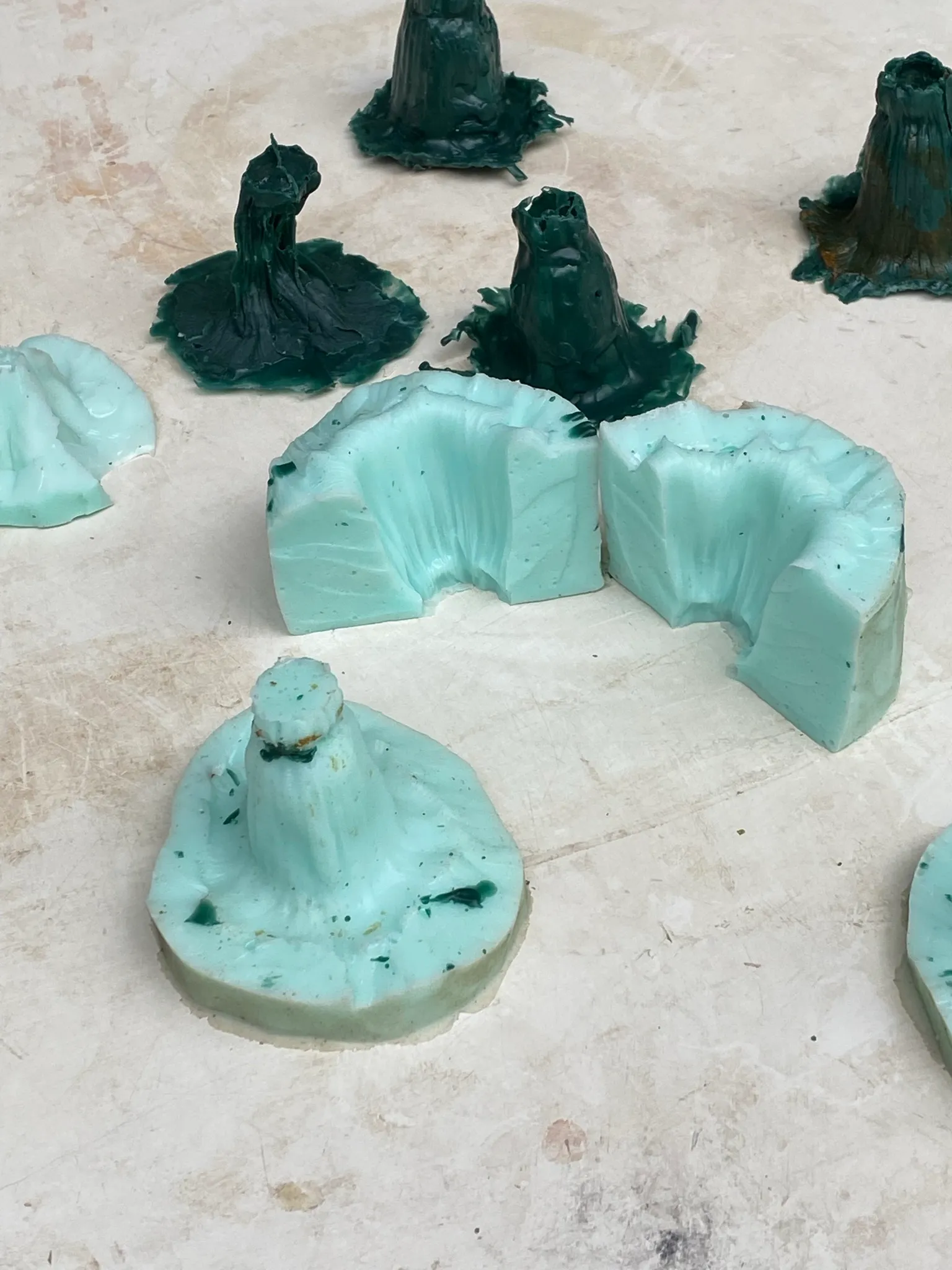
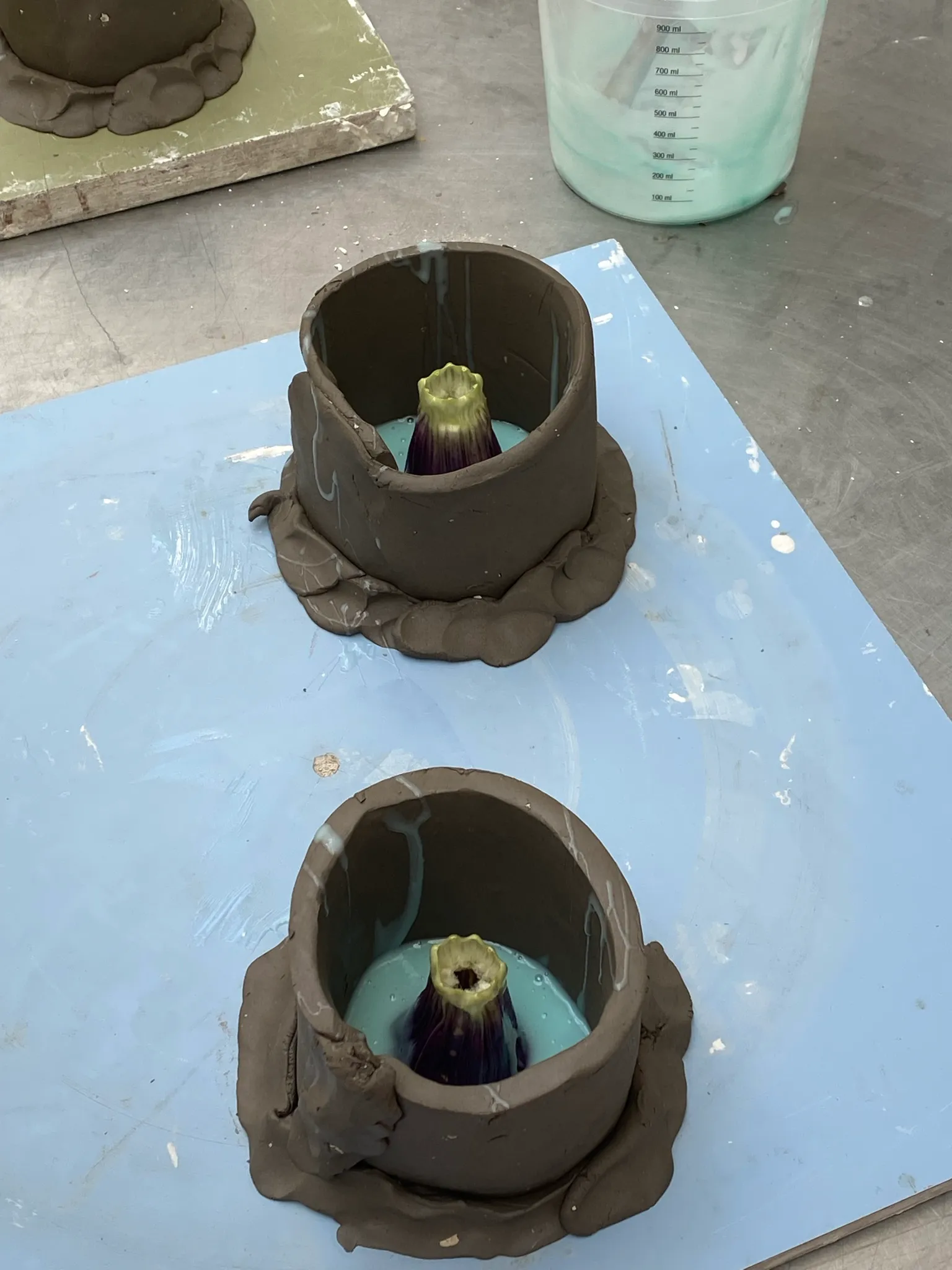
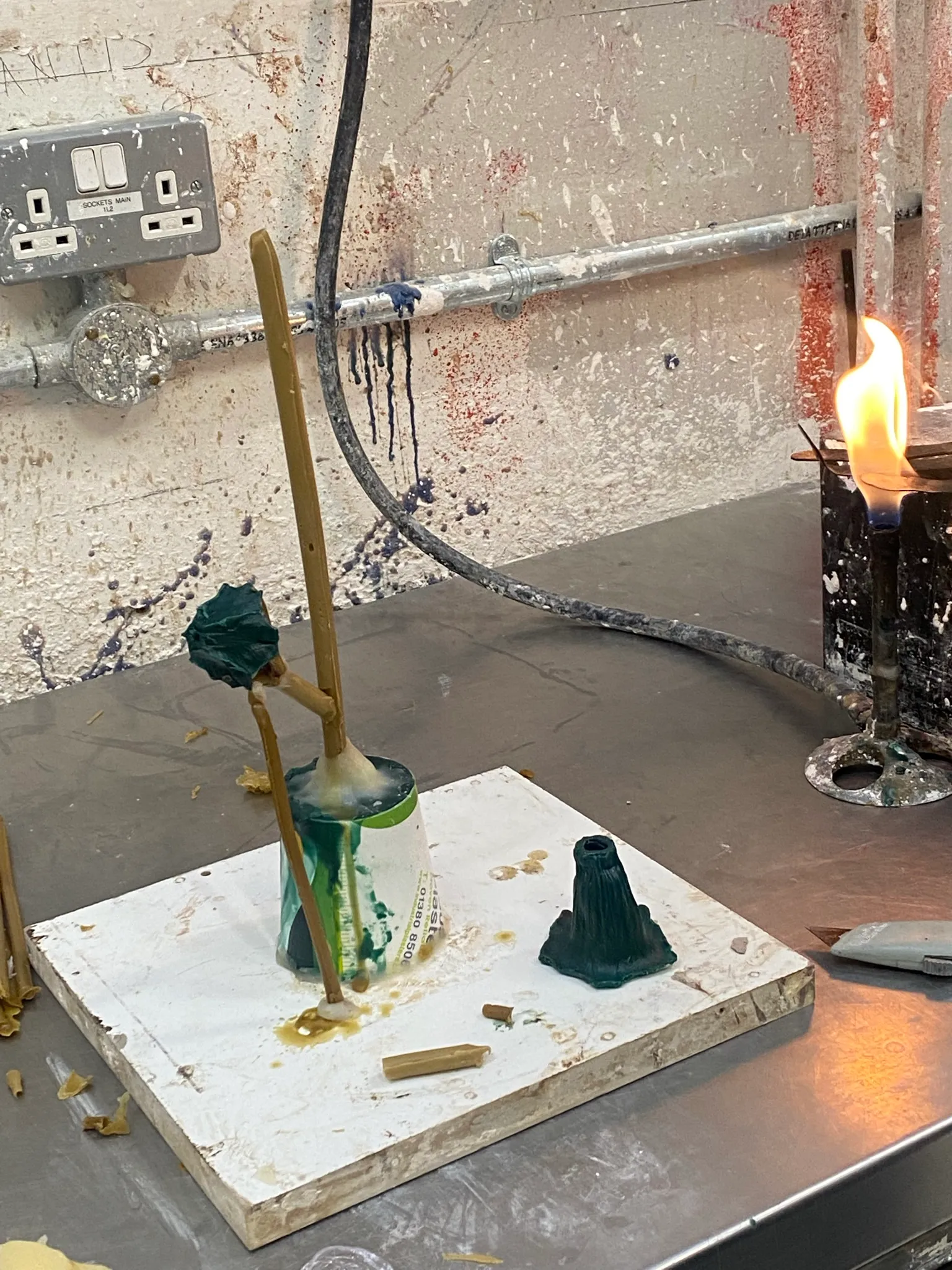
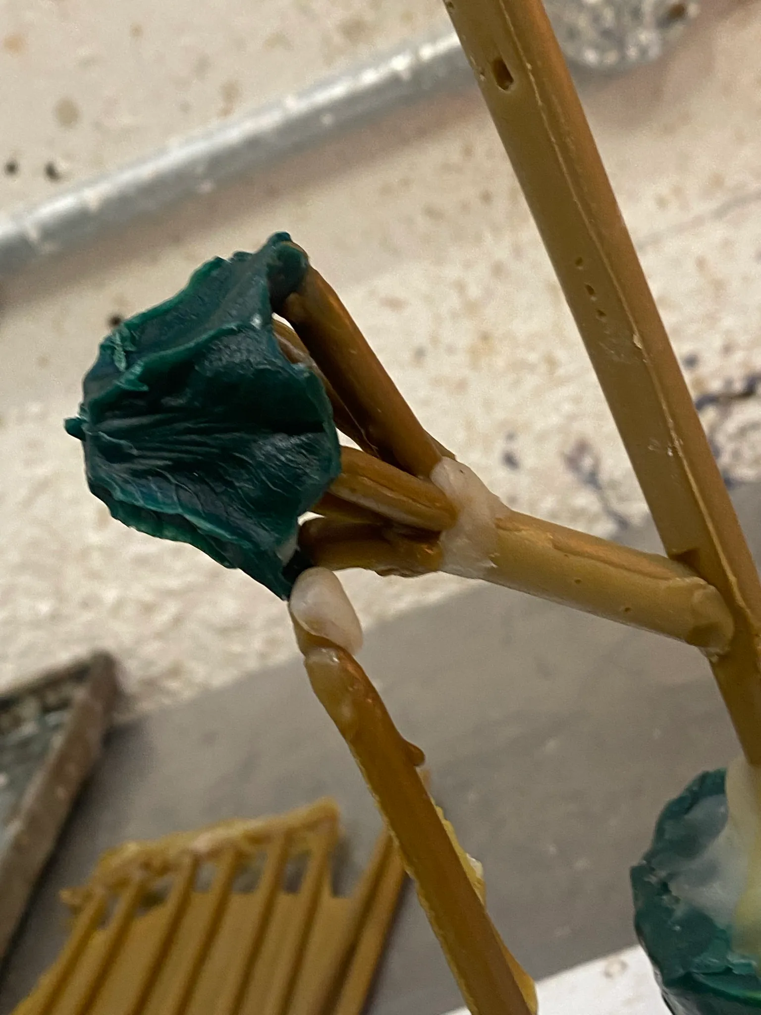
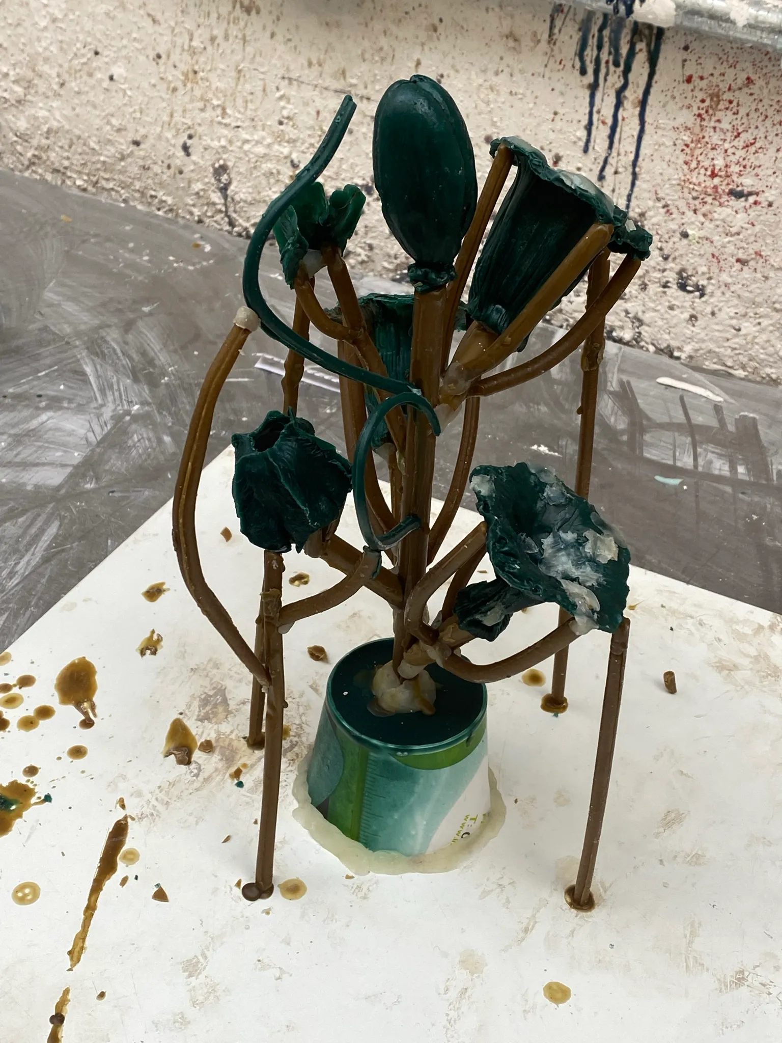
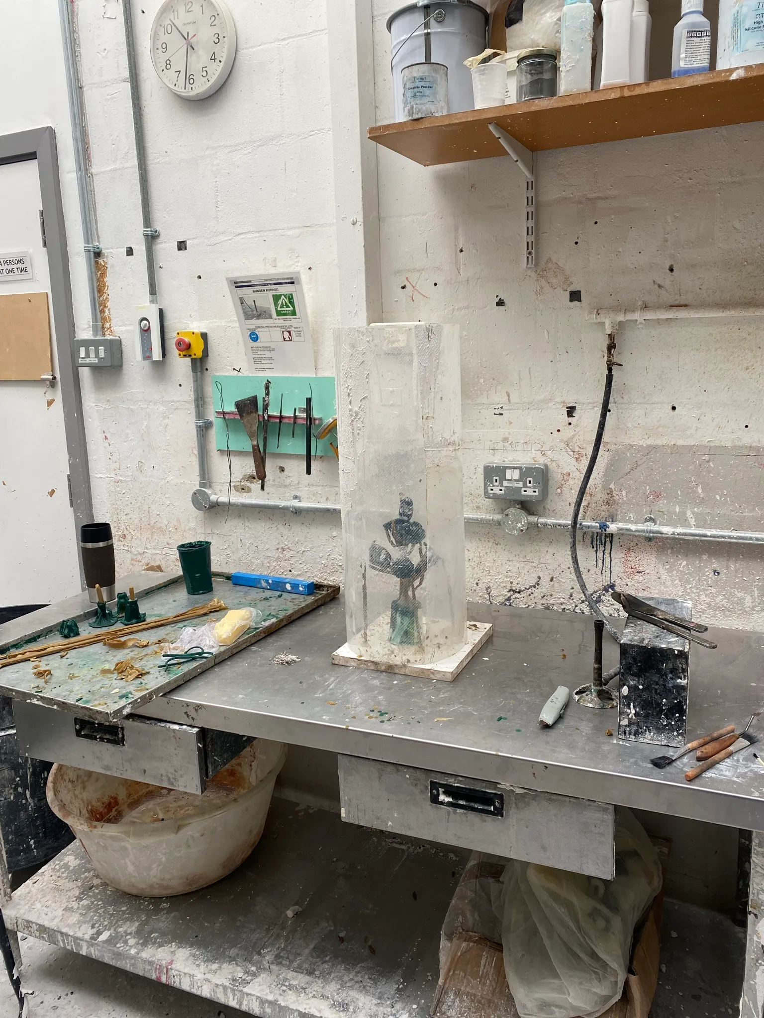
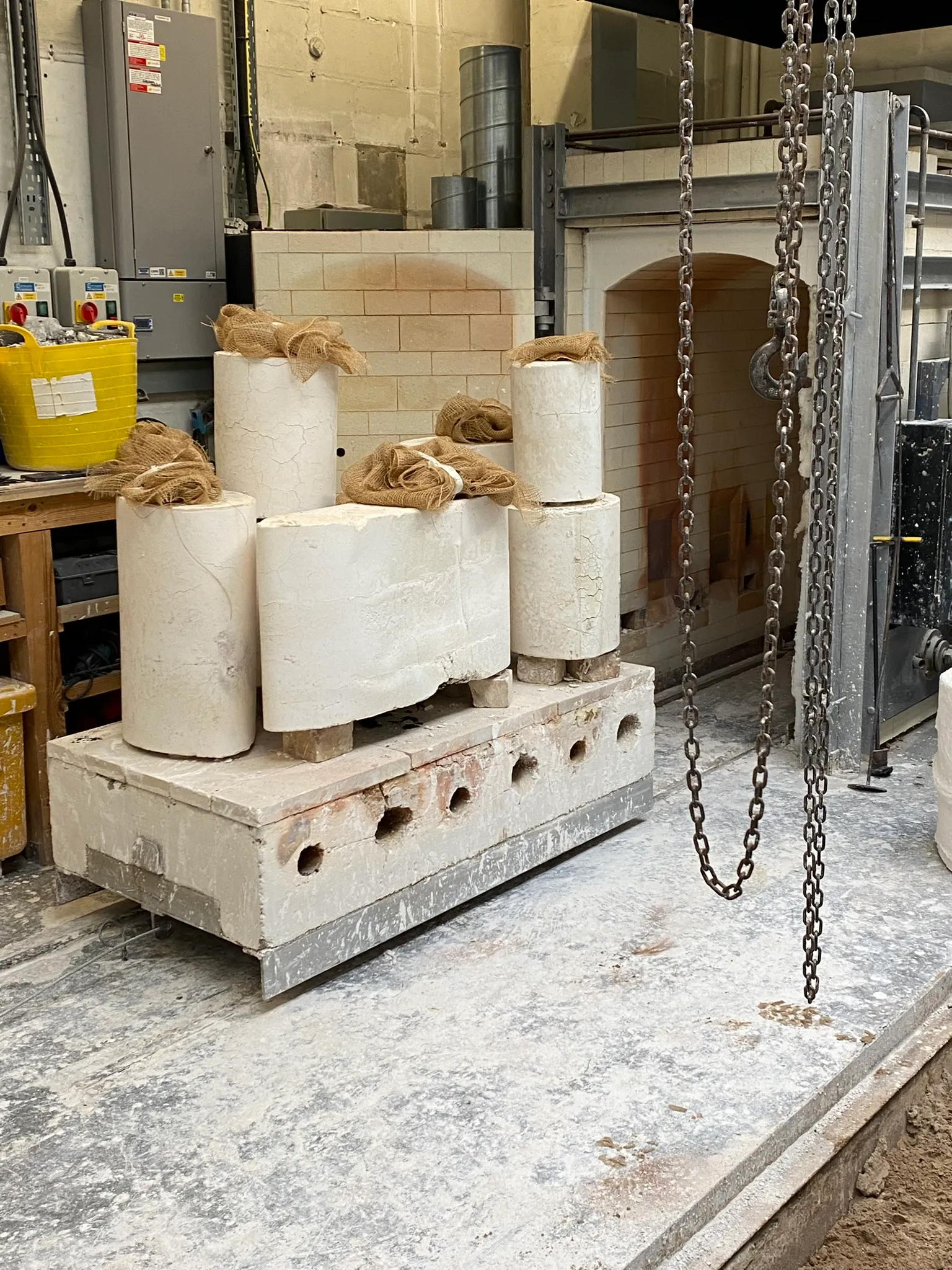
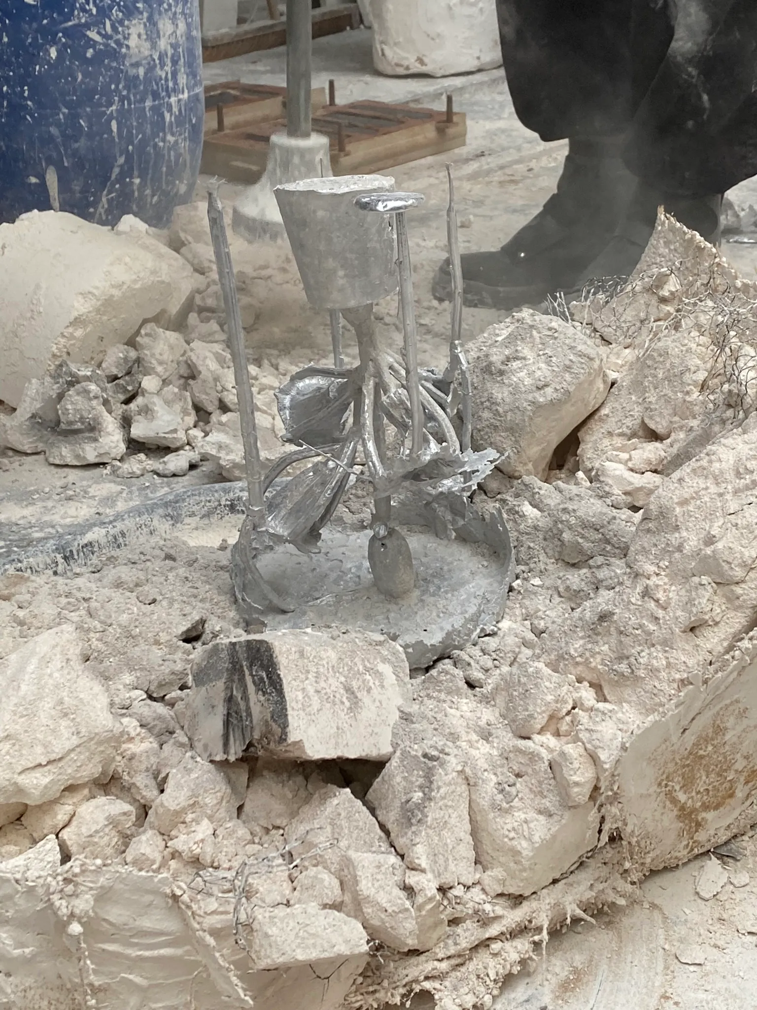
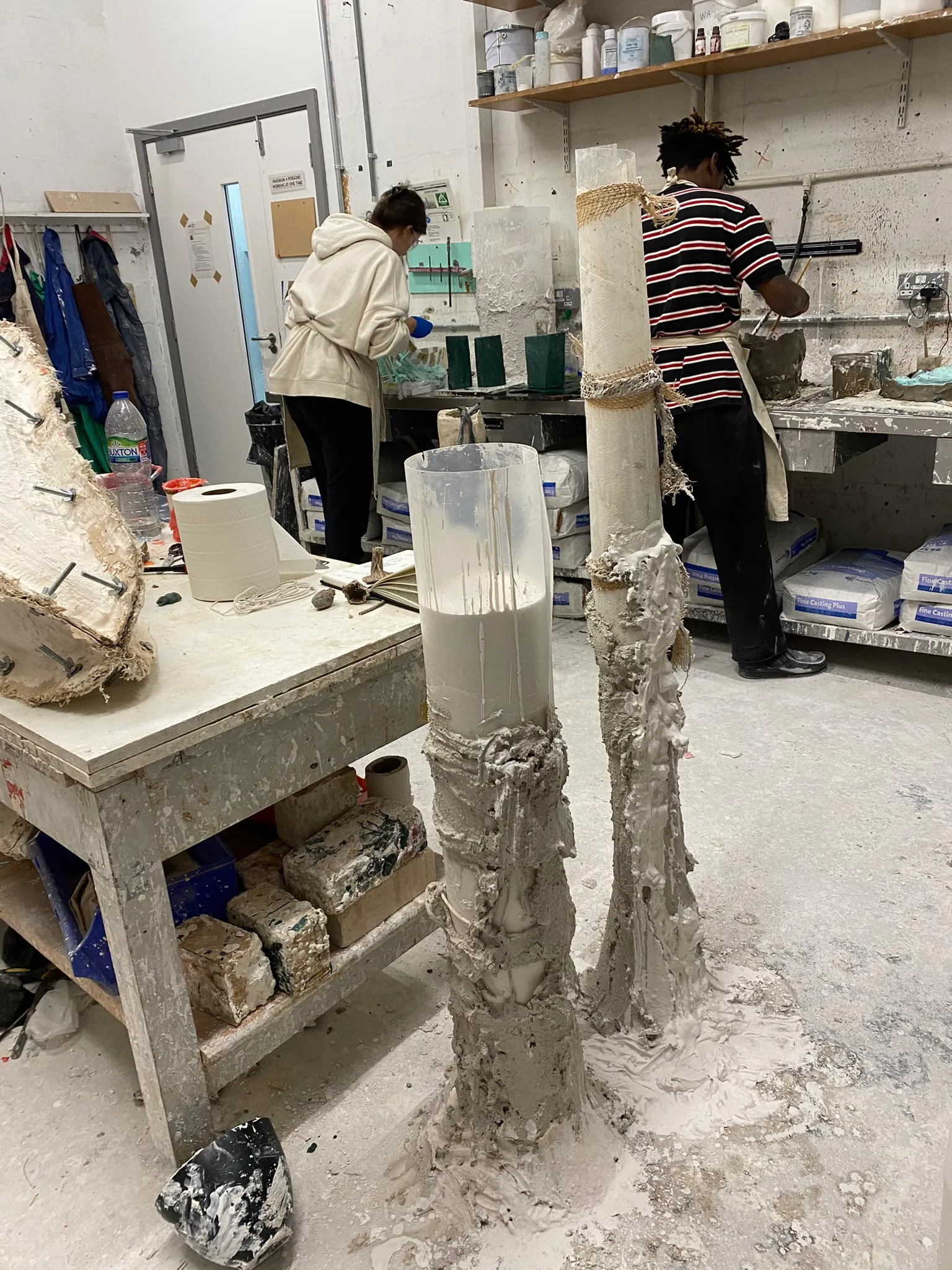
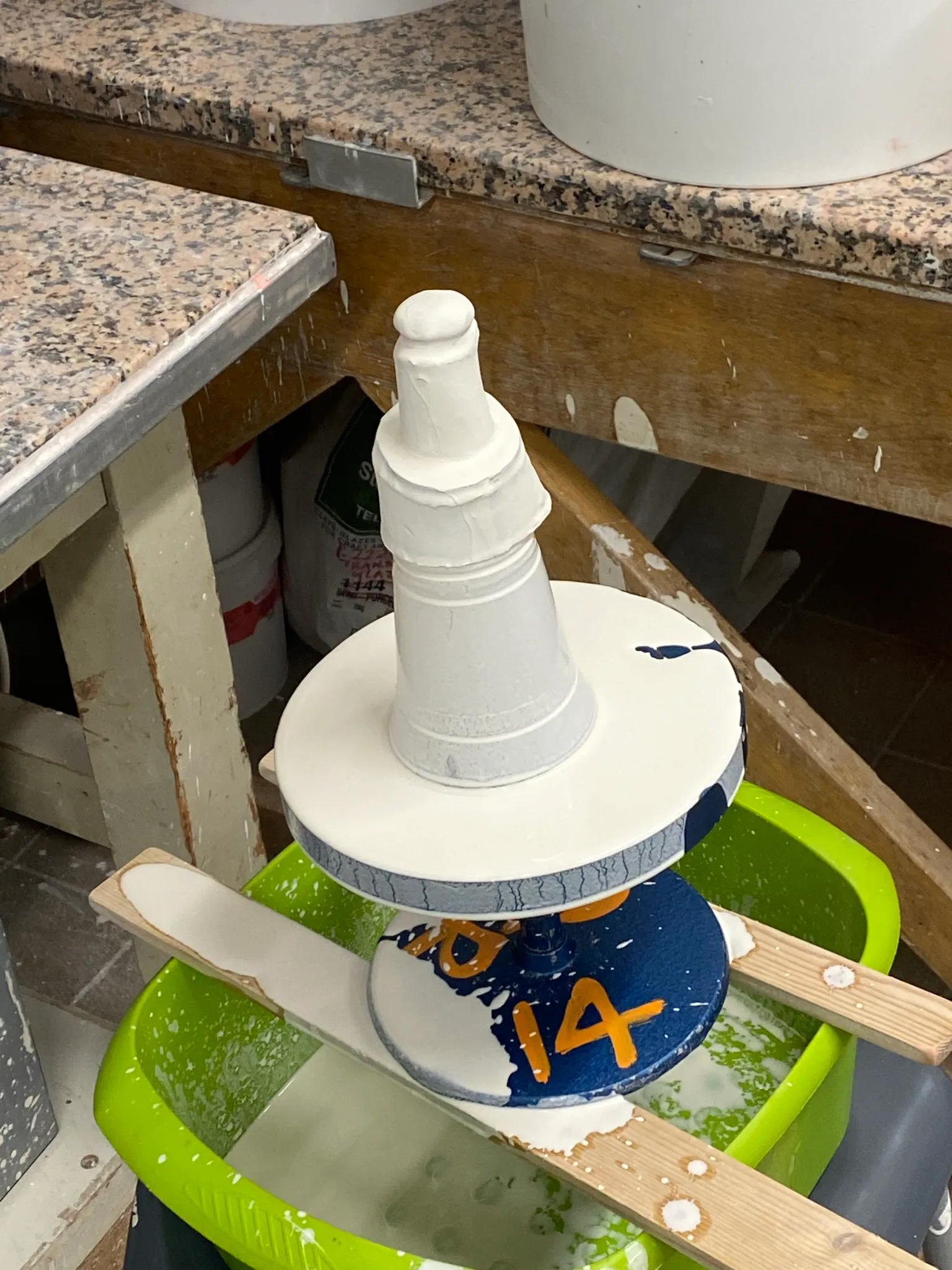
Finally happy with the result of the wax flowers, there is one final step. You need to make a kind of wax tree, where all the flowers are attached to. They also need to have air channels, each one of them. Then you pour plaster around this tree. Once placed in the kiln (upside down), the wax will melt and drip out, leaving a negative space for the bronze or aluminium.
This method is called 'lost-wax'. It's a very time and energy consuming method, but you have quite a lot of control over the cast, and it can be quite detailed. Other methods are the sand-cast method, where an object is pressed in sand and later the bronze is poured directly into the sand. Or a method which is called 'direct burn', where you place a combustible material with air runners inside a plaster mould. As the materials is combustible, it will burn out in the kiln. Next term I would like to try especially sand casting, as I think it can be faster and maybe more intuitive.
Pouring bronze and aluminium
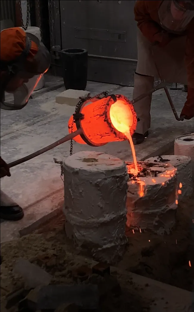
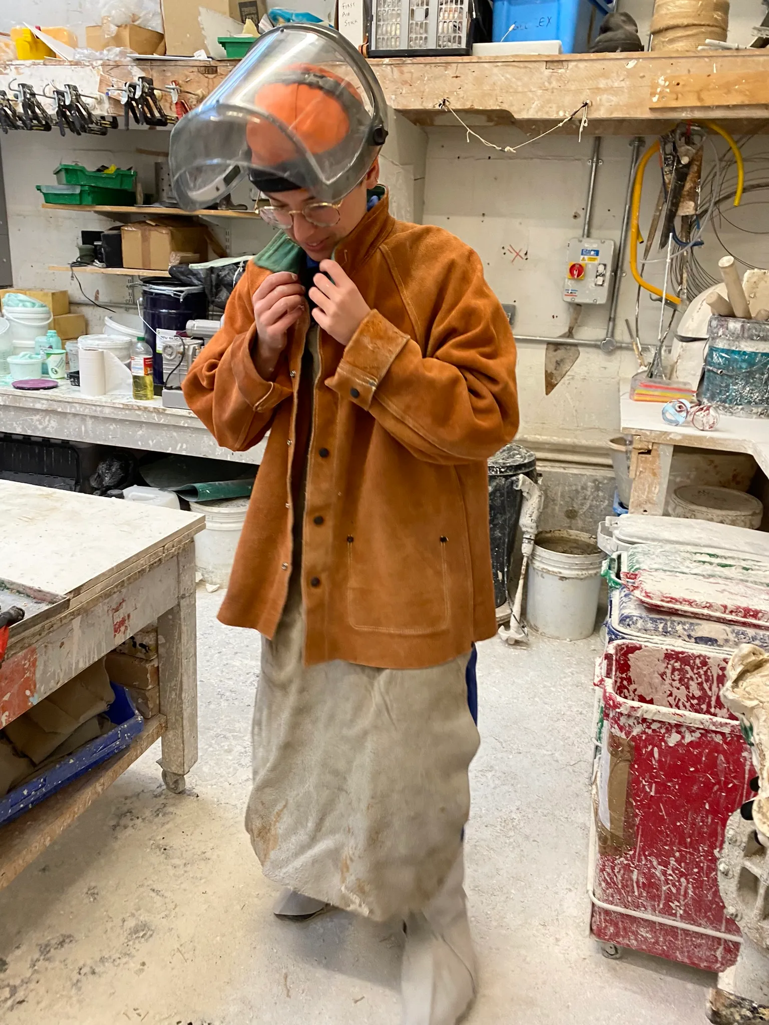
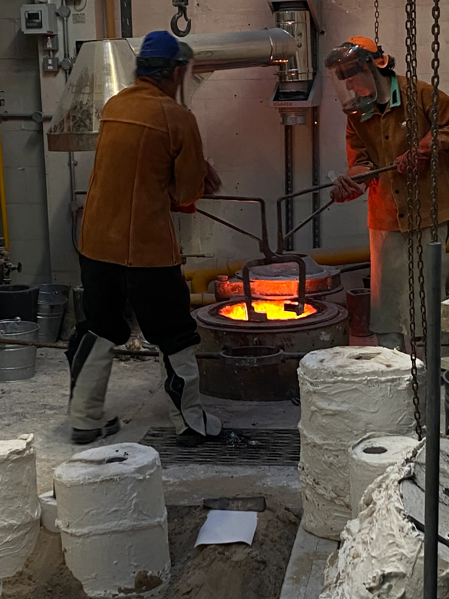
Finally the day arrived. We would cast the bronze and aluminium. As I had so many wax flowers, I decided to make one wax tree for an aluminium cast and one for a bronze cast. I wanted to see what the different materials would feel like, and which one was best to capture the essence of this flower.
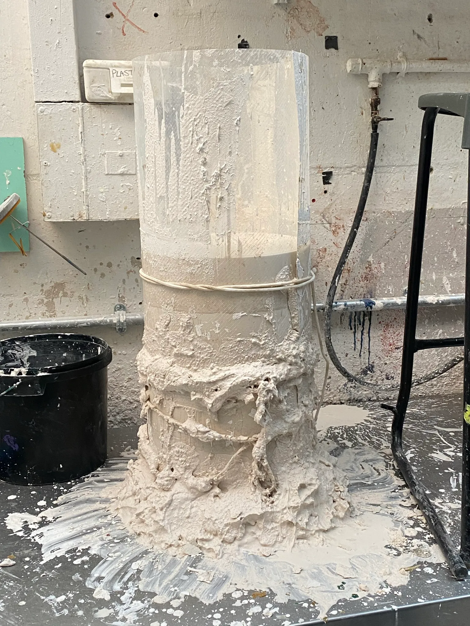
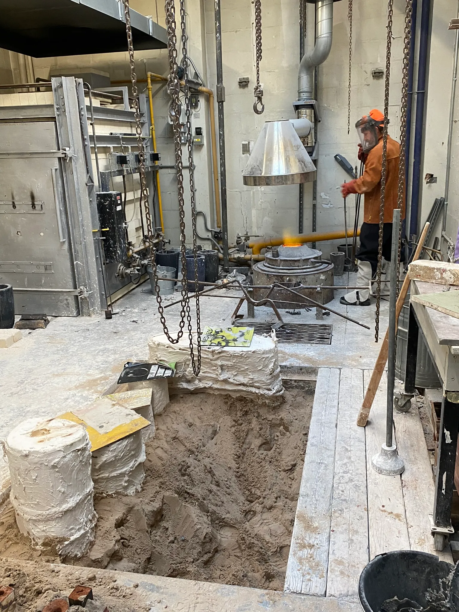
I helped preparing the moulds for pouring. They have to have an extra layer of plaster and hessian, because they became very brittle in the kiln. Afterwards we placed them in the sand pit, dug in, so they are stable and if any material is spilled, the sand can absorb the heat.
It was kind of magical. You wait the whole day, preparing the sand pit, heating the material. Then the pour is done is 5 minutes, but requires a lot of focus from the technicians and you can feel their adrenaline. I'm so fascinated by this material. The process is so intense, you almost forget about the finalised object.
Getting the cast out
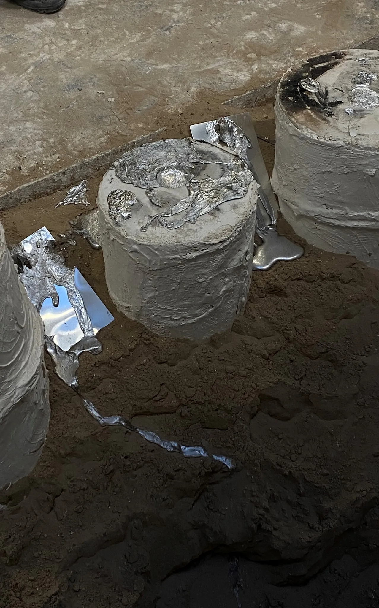
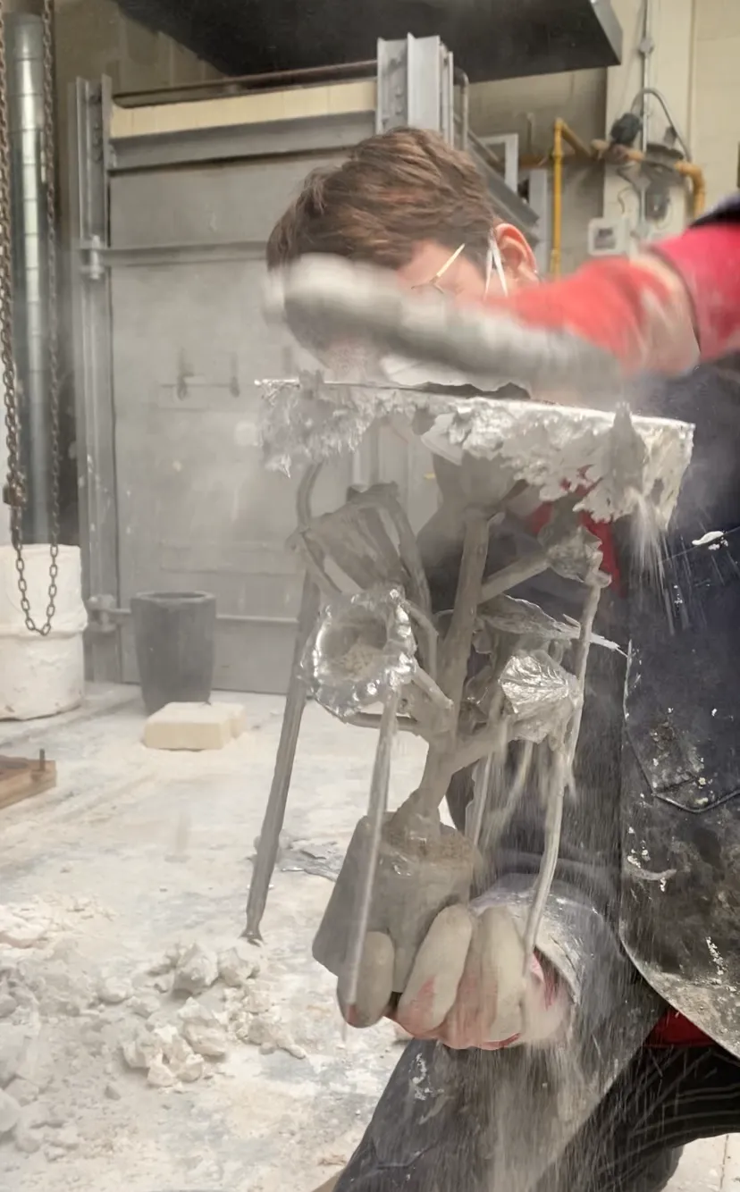
I know, unbelievable, but we're not done yet. After the material is poured, there is a whole other stage of craftsmanship that starts. Once you have opened up your plaster mould (a very satisfying moment), you can start cleaning up your artwork. You start with cutting off all the runners and air channels that have been poured as well. This material can be re-used. Then you start a long process of filing and grinding down.
As this is an experiment I didn't go too far with the filing down and kept my figures quite rough. Maybe in the next term I will spend some time taking them to the next level.

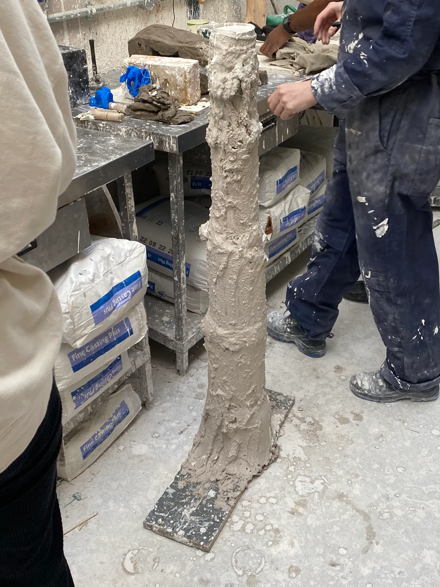
Plinths for flowers
During this process, a kind of fondness towards the aesthetics of everything that has to do with this process developed. The knots in the hessian drenched in wet plaster or the finger marks that are still visible after smearing the plaster out in the final mould. Everything is so practical, has such a specific and straightforward meaning. A knot to hold something together. A white mould because plaster is white. The bronze is bronze coloured, as it is bronze.
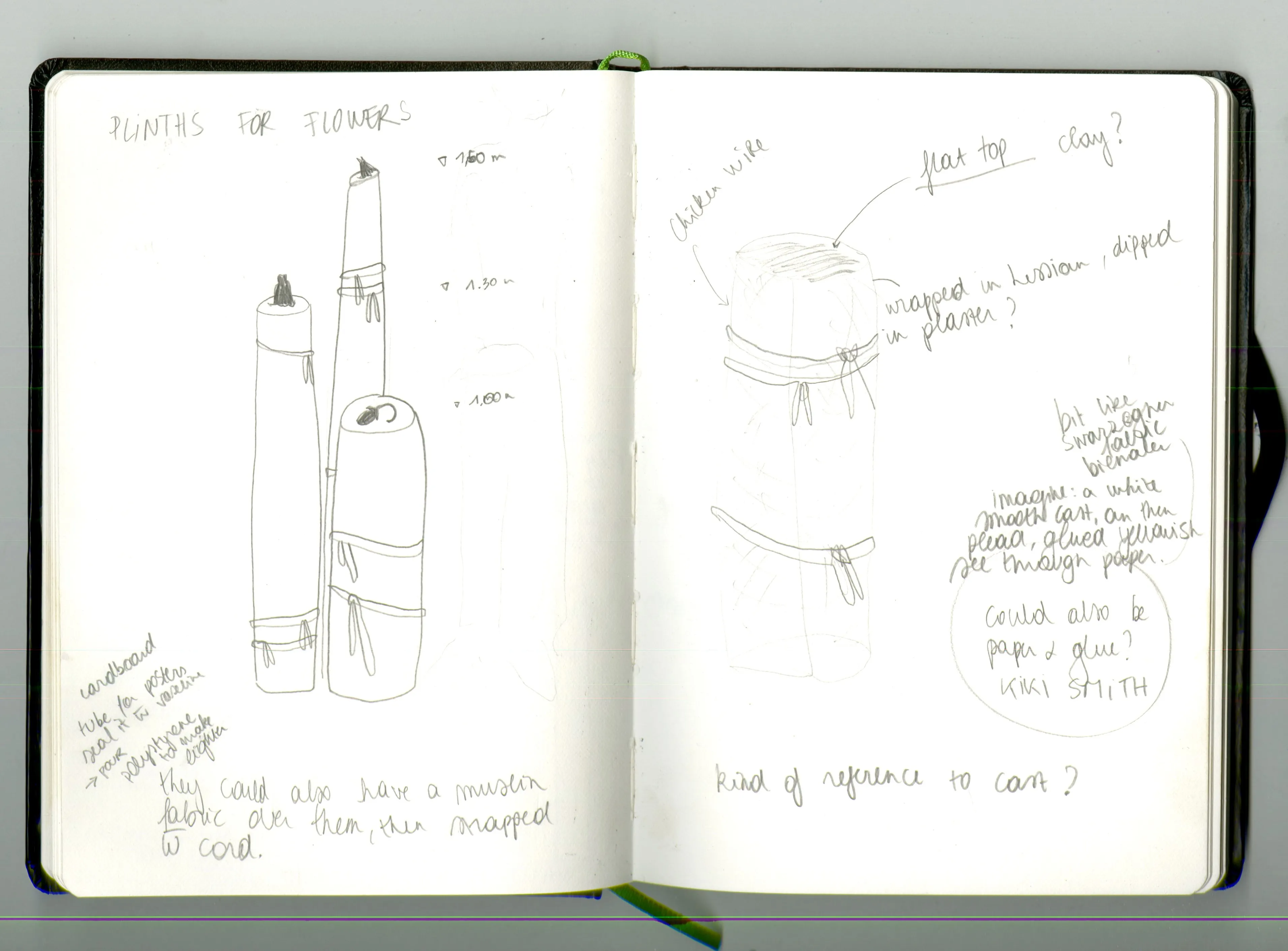
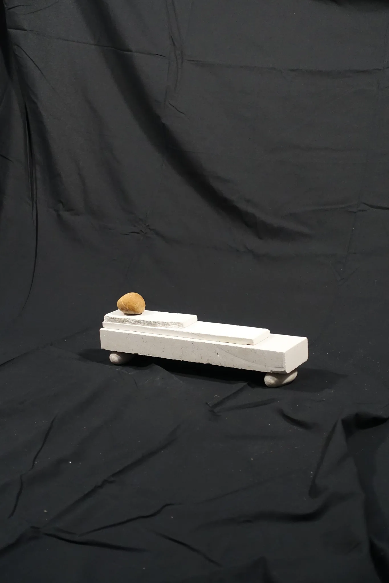
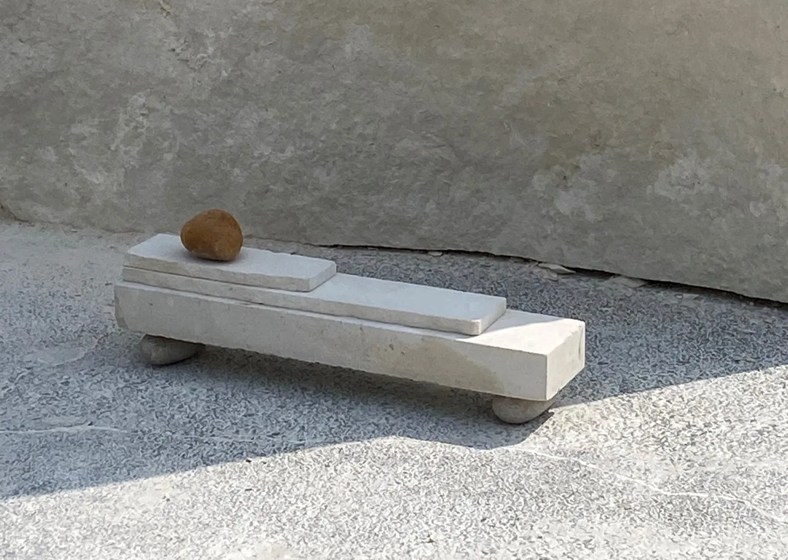
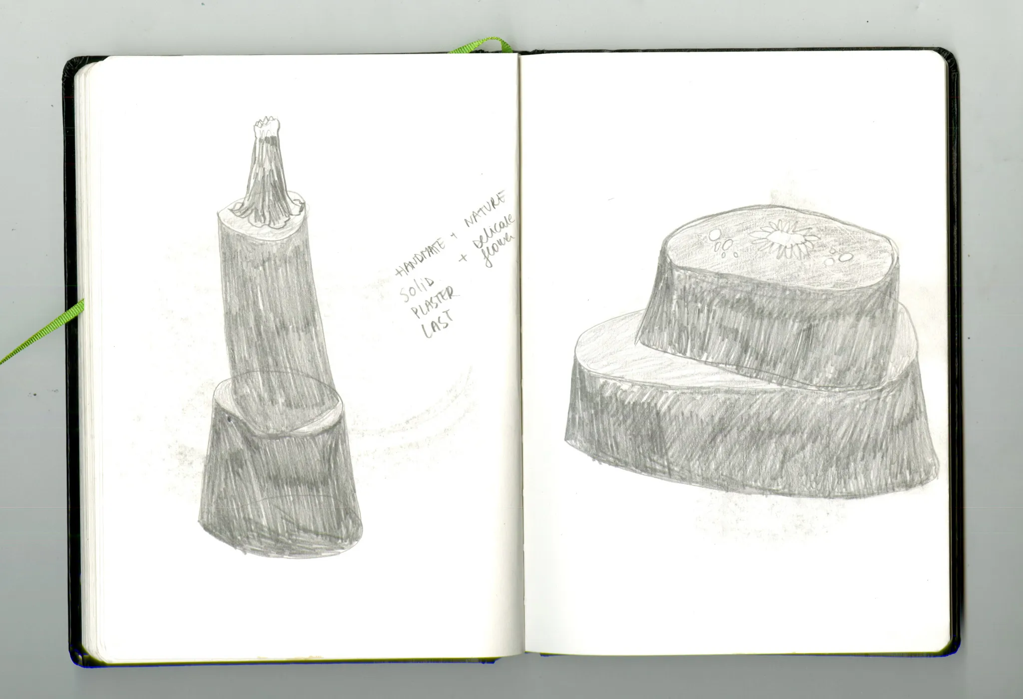
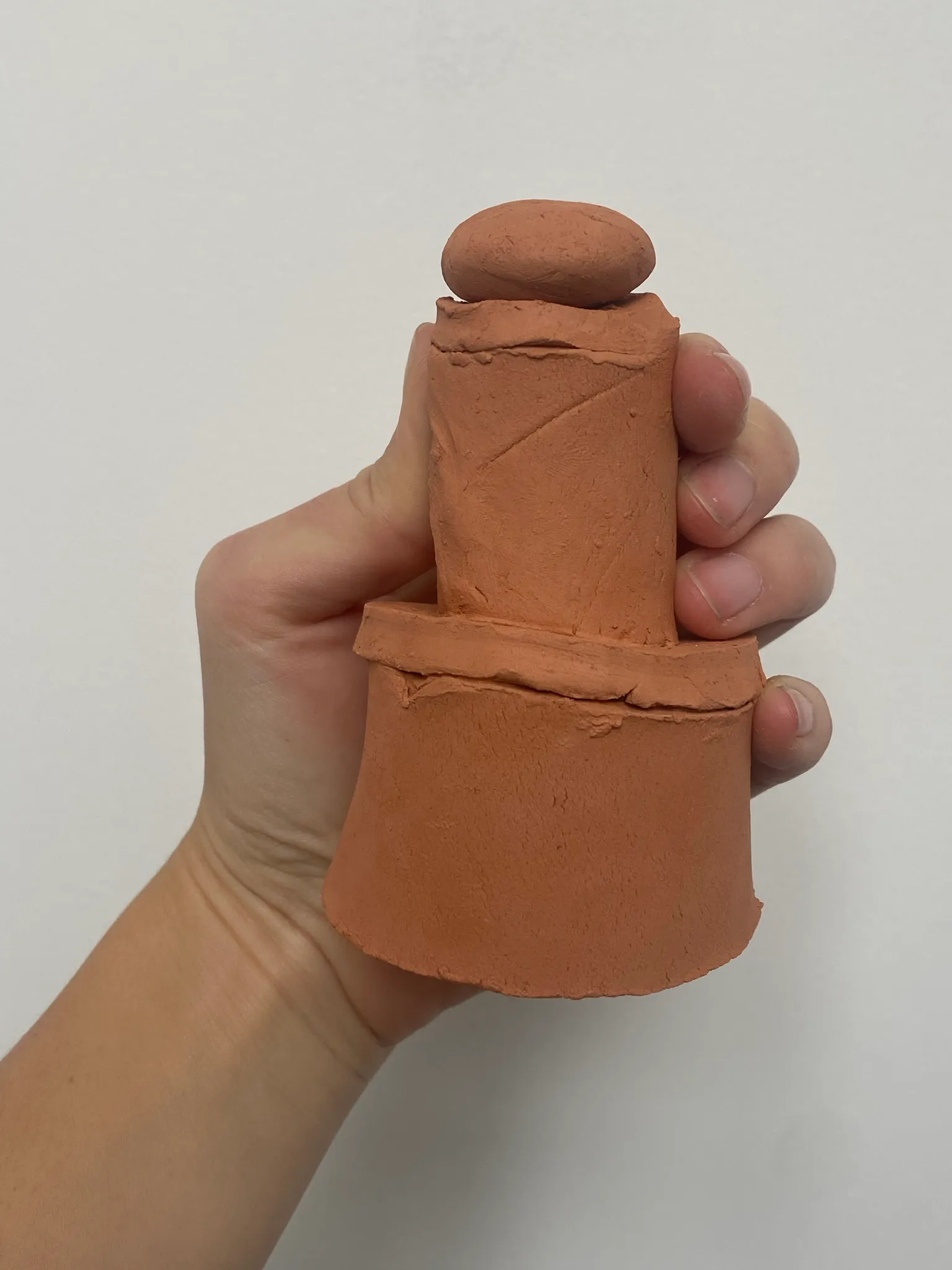
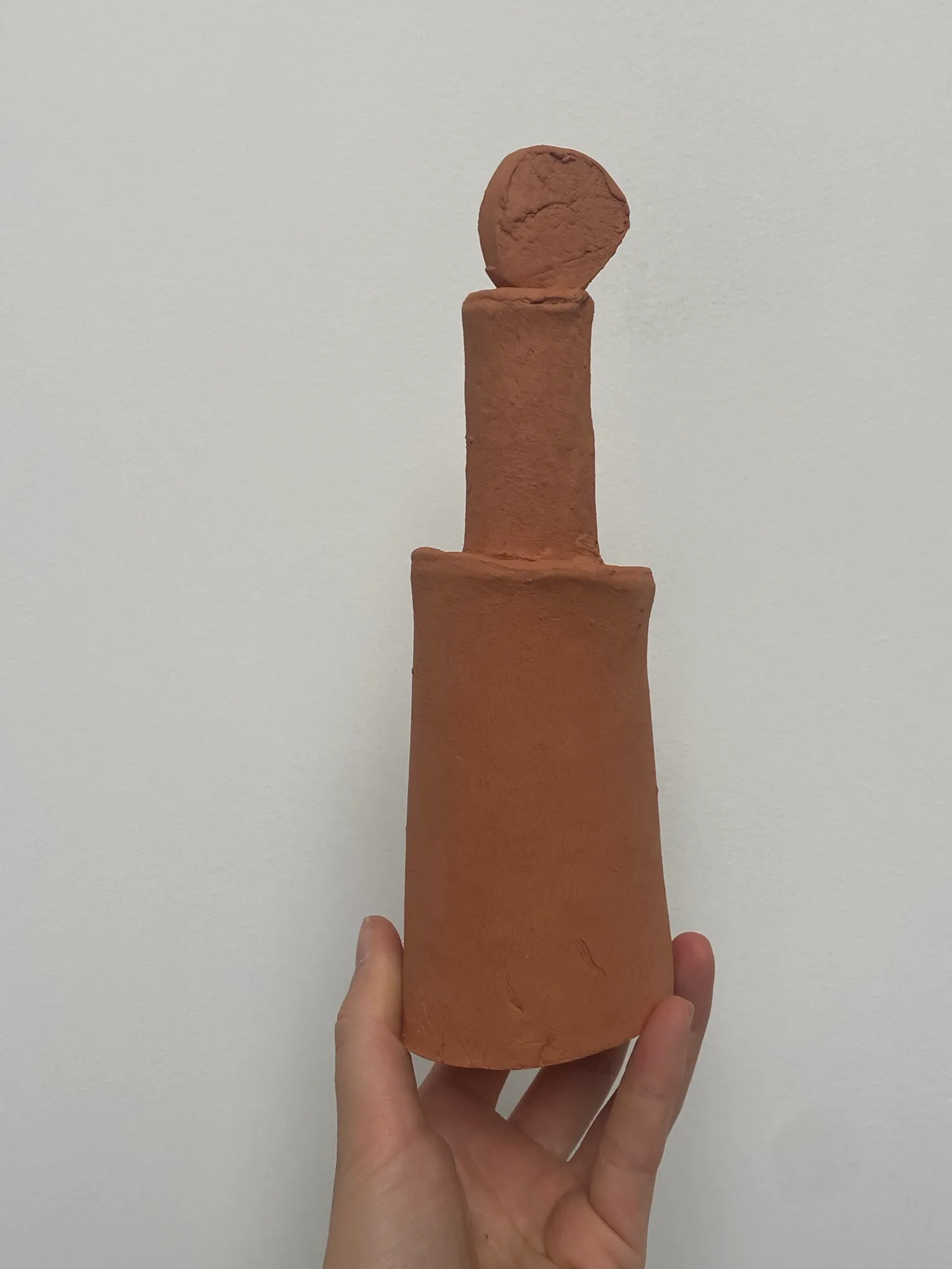
The idea developed for three plinths, different heights and different diameters. One for each flower. I liked the idea of elevating the cripled one, the most fragile one, as highest. The one that lies down, would be the lowest, close to your belly. The columns would be irregular, and have knots around them, just as you need to do for any plaster casting process. I felt this reference to the process was appropriate and tied everything together into one sculpture, one whole.
Finished artwork
I'm quite pleased with the result. The process took a lot longer then I expected, but I learned a lot. And I also enjoyed being in the process and focussing on the skills and specialised knowledge to make things.
To see the final artworks, click on of the two materials below, or have a look at references/context.
From captured image towards present object
by Nele Bergmans // January 2023
Struggles with images
I have noticed how photography is a big part of my practice. I think probably of everyone, we live in a visual world where we more than ever before take in information through images. Sometimes I spend longer taking photographs of the work I created, then actually creating it. It is as if the perfect image will give validation to the work. Why? True, the image is very powerful. 95% of all your viewers will probably see your artwork through images, instead of real life. So the image is part of the life of the work. Is this good or bad? I’m not sure. But to not be a slave to the slave to the digital image, I thought it could be interesting to push it into another material, and to try and develop it as if it’s a body of work on its own.
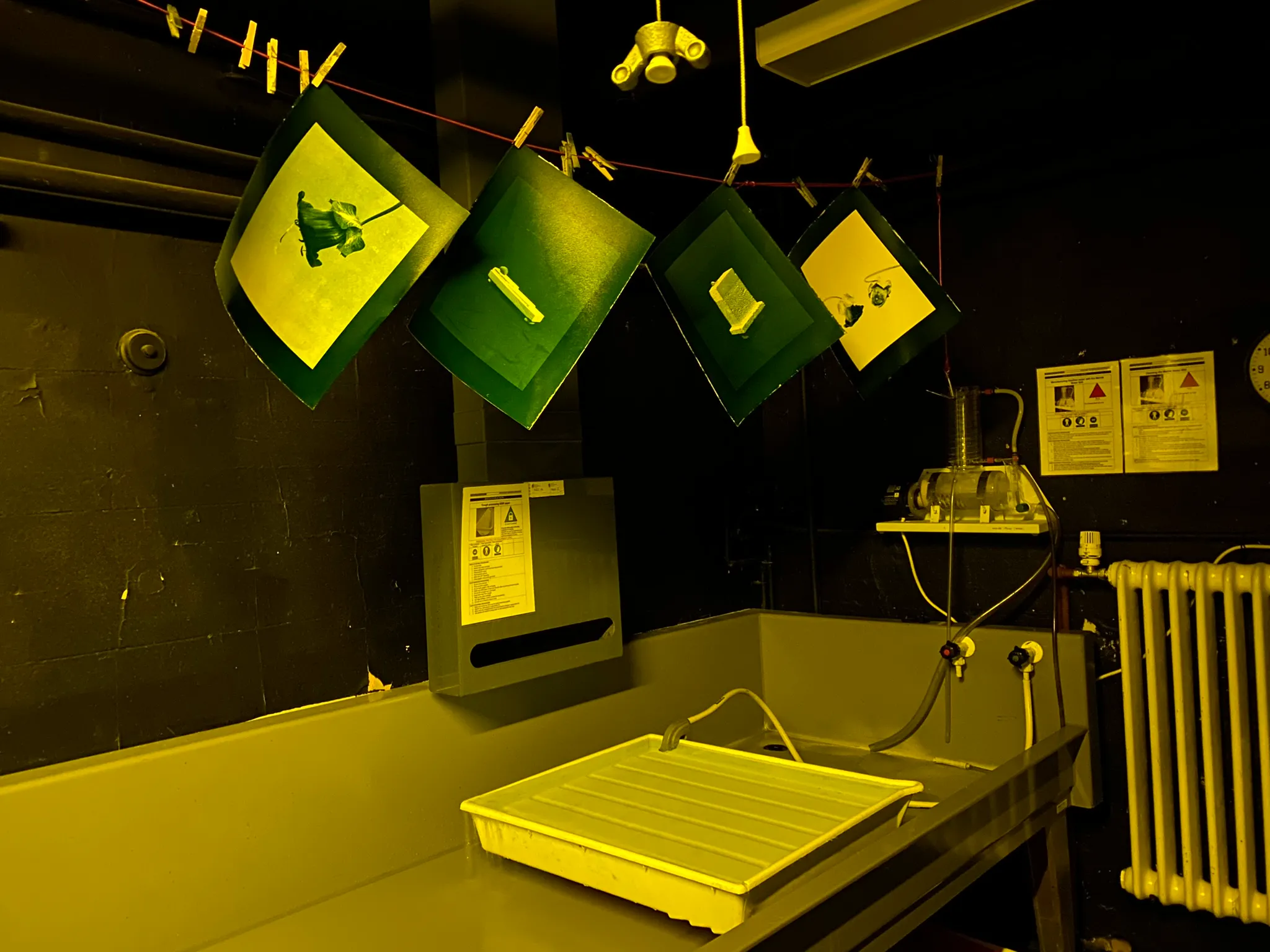
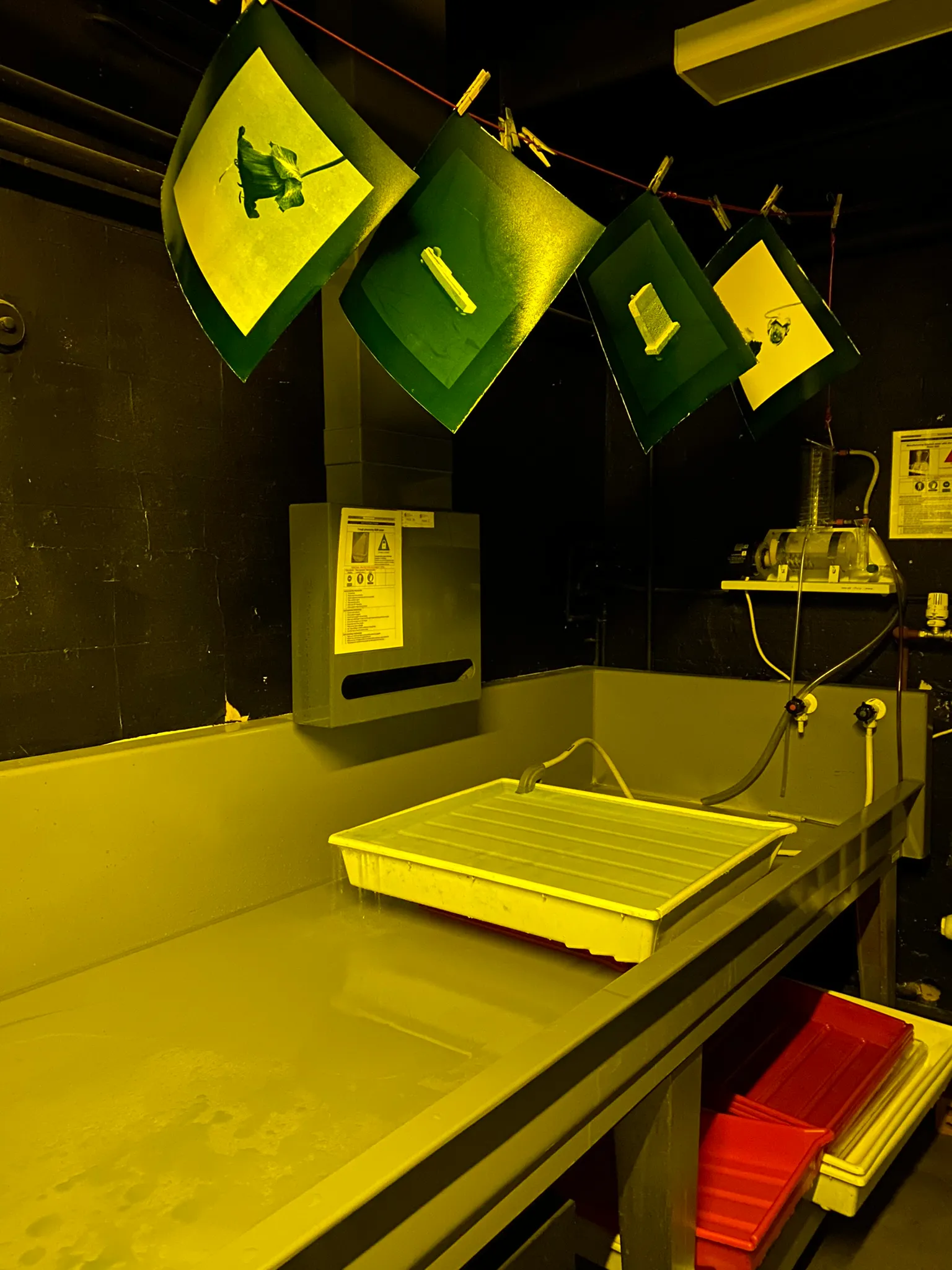
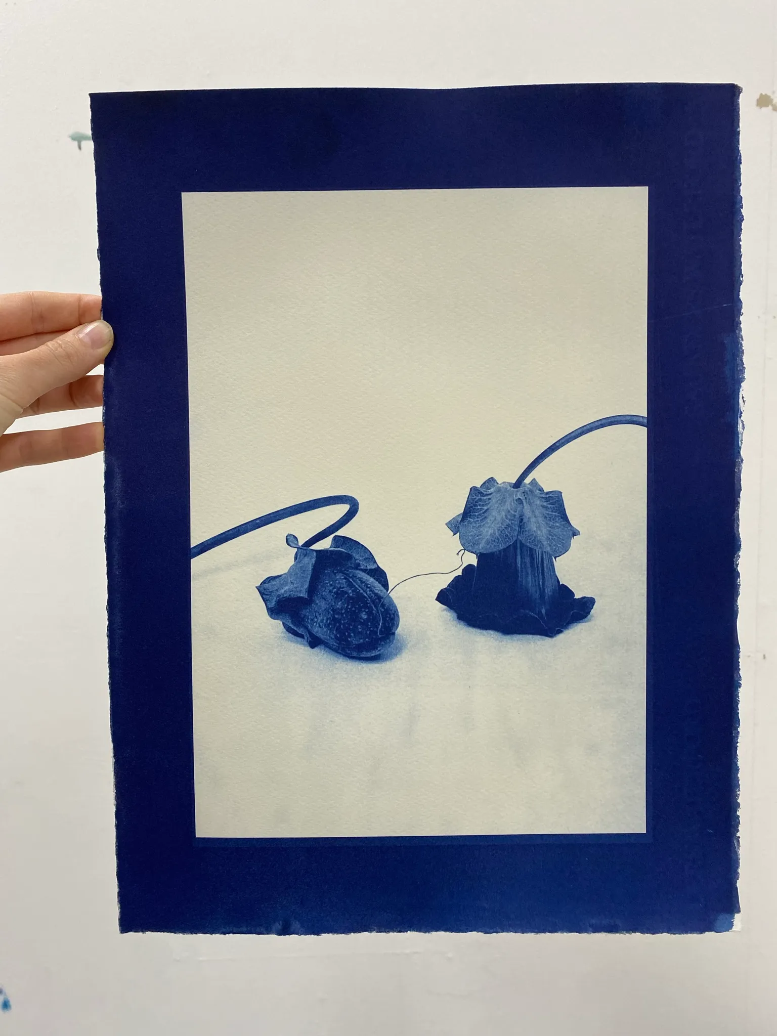
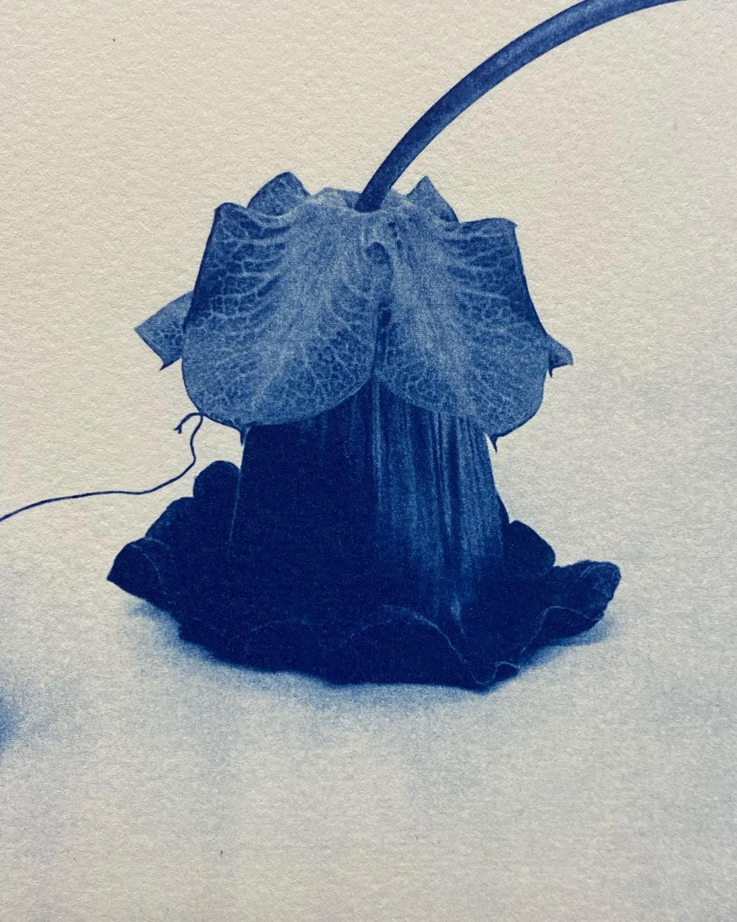
What I’m focussing on when taking pictures, is the angle, the frame, and the atmosphere. To start exploring the materiality I chose to learn how to develop my images as cyanotypes. It’s a very accessible and relatively fast process. You mix two chemicals, coat your paper with them, put them in a UV-light box with your negatives/objects on top, and wait for 20 minutes. Then you wash of the chemicals and let it dry. And there it is, a dark blue, richly textured image that has something appealing to it you can’t quite explain.
First steps in the darkroom
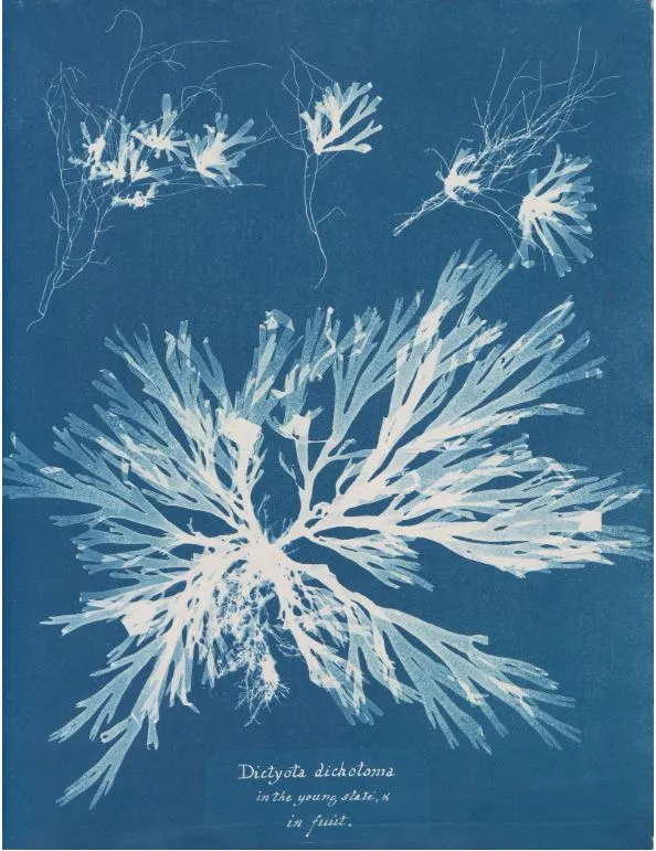
When reading up on cyanotype, I found out that it works well as a photogram with vegetation. In 1843, Anna Atkins was documenting British algae this way. She is considered a pioneer of this technique and made a wonderful book of algae with more than 400 prints. When making photograms, one basically places on object on a light sensitive paper, and the object itself creates the image because it doesn’t let light through.
Since I was working with flowers, the medium seemed very appropriate. But I also liked the idea of playing around with objects on top of the page. I was in the process of trying to bring my 2D drawings into 3D objects. At the time I was trying to work with clay, but I was missing something in the sculptures that I did have in the drawings. Maybe a 2D drawing of a sculpture could be combined with actual stones by printing the stone directly onto the page with the cyanotype technique. Or another idea was to try out a photograph negative of a sculpture, and place a flower on top in the lightbox. I liked the possibilities of mixing 2D and 3D, immediate printing from source material, and the changes of scale and perspective.


weighted down by glass plate
My first attempts were rather poor. The results didn’t match the joy of the process or the richness of the idea. The negatives were not good which led to prints that were too light, but also the placing of the flowers didn’t catch the detail that I hoped it would, like in Ana’s prints. Same story for the stones, the identity of the stones lies in the outline and in its texture, two things I lost in this process.
One image did come out well. The negative of a very strong photograph of two flowers. I decided to continue to work with negatives only and no photograms.
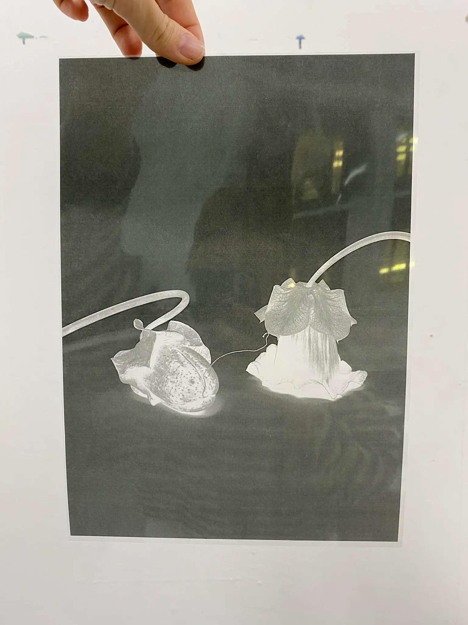
Working with digital negatives
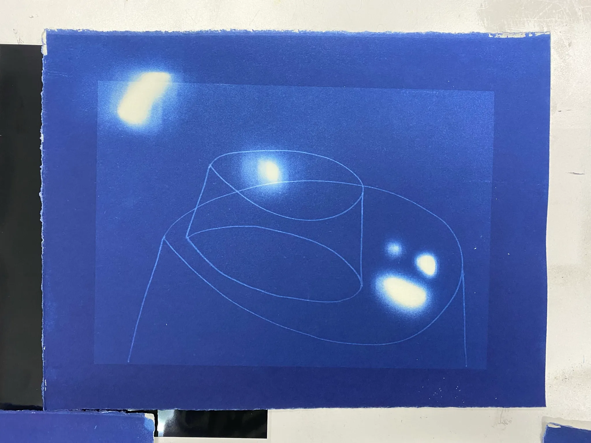
I tried to learn how to edit my negatives to have the best tonal range of blue. Quite dark without losing detail. I experimented also with time in the UV-light box: brought it down to 10 minutes and left it in for 30 minutes other times. After some experiments, I felt I knew a tiny bit how to get a good print out. I really liked the blue border with the white negative space and blue flowers. But I thought it could be also interesting to try a completely blue image, and have the subject be white in the middle. It took pictures of my stone sculptures against a black backdrop in order to experiment with this idea.
Softness
There is a certain softness to these cyanotypes. It really brings to image into a realm of materiality which wasn’t there before I believe. It kind of allows the image to be an object as well. I find it interesting to approach the same subject from different angles and use different materials.


I'm quite pleased with the result. The process gave me extra time to spend with images, but in a more involved way that I really enjoyed. In the next term I hope to explore some other photography techniques as well.
Translating drawings to sculpture: looking for a material language
by Nele Bergmans // January 2023
Stacked shapes with circles on top
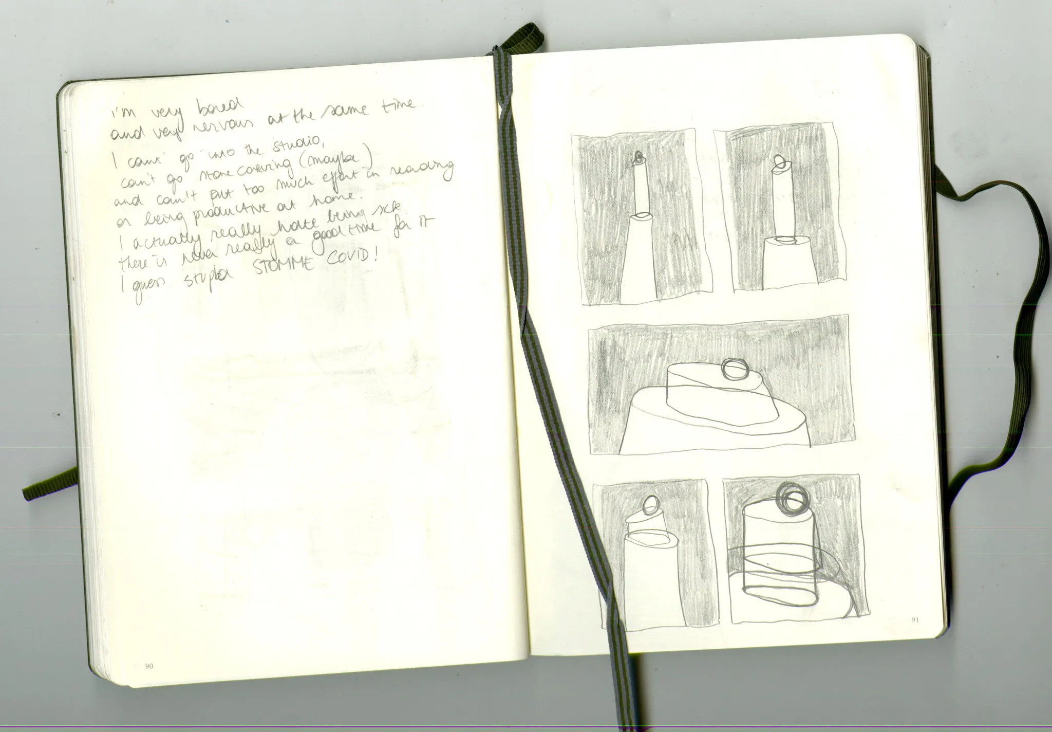
A while ago I started drawing stacked shapes with circles on top. I was really interested in the free flow of the lines, where it would cross with other lines an create space in between. I was interested in the balance, the composition, the play, the simplicity and tension. After making dozens of these kind of drawings, I wanted to see if I could create this kind of free from in three dimensions, give it another materiality. At the time I was already quite interested in stones. I made stone sculptures that were exploring the same themes, and I wanted to see if it was possible to experiment with other material as well.
Material honesty
I started thinking about possible materials that would give me freedom. I thought about cold metal sheets, folded. Or paper. But I decided on clay. When writing the first research proposal, I was thinking quite a lot about materiality and intuition, and I wrote the following:
“The work is about materiality, so I will explore new materials and techniques. The main principle that I will use as a guide, is material honesty. With this I mean that the shape of the work flows from the language of the material, that is not manipulated, and that the techniques used to make the work are those most basic and intuitive. This way, I want to achieve a synthesis of the material itself and the shape that has been made with it. I think once this is achieved, humans project certain universal unconscious feelings onto an artwork. This is maybe where beauty lies. “
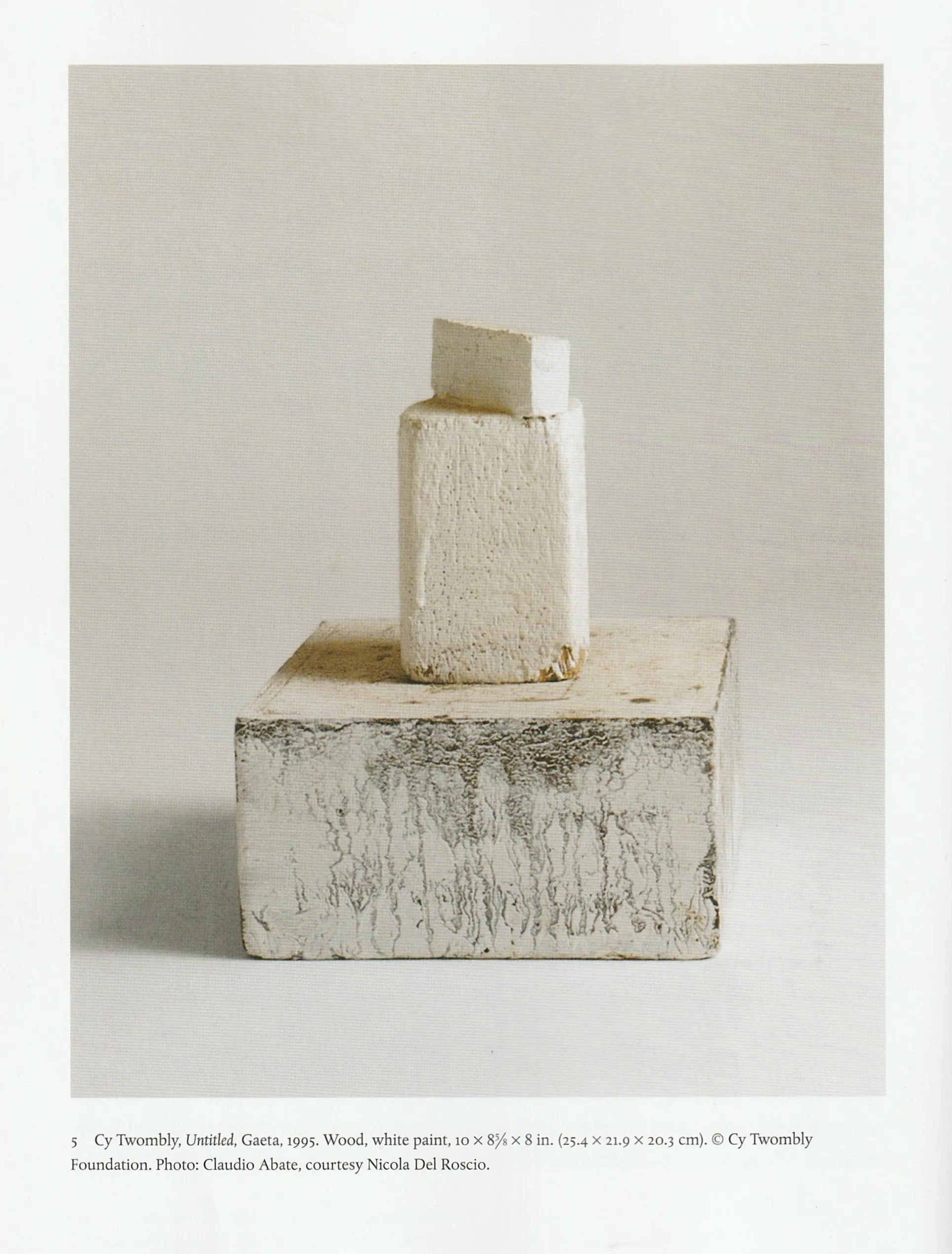
Trying to define for myself what that meant, ‘material honesty’, I came across the work Folding Column by David Hamilton. I was drawn to it by its simplicity, its expressiveness, and the way the meaning flows from process by embracing the material. It’s extruded clay. You can see the slabs of clay, you recognize the malleable material. You can almost see him making the work, pulling the slabs, at the point where they would collapse, and then folding them over, letting the weight of the do its thing, defining the shape. And still I find it very poetic, this sculpture. It’s very honest and aesthetically beautiful at the same time.
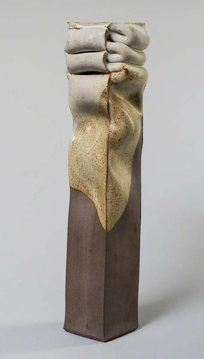
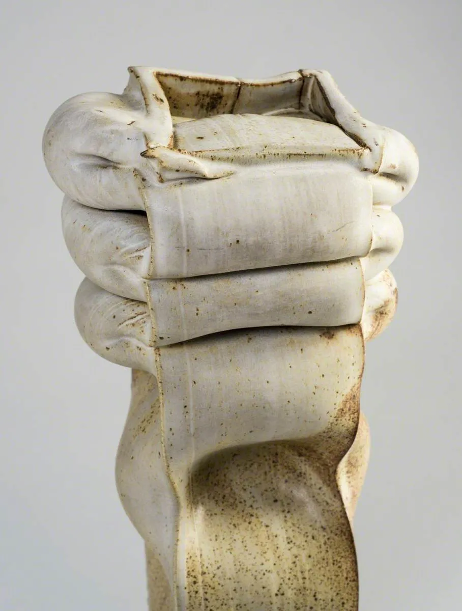
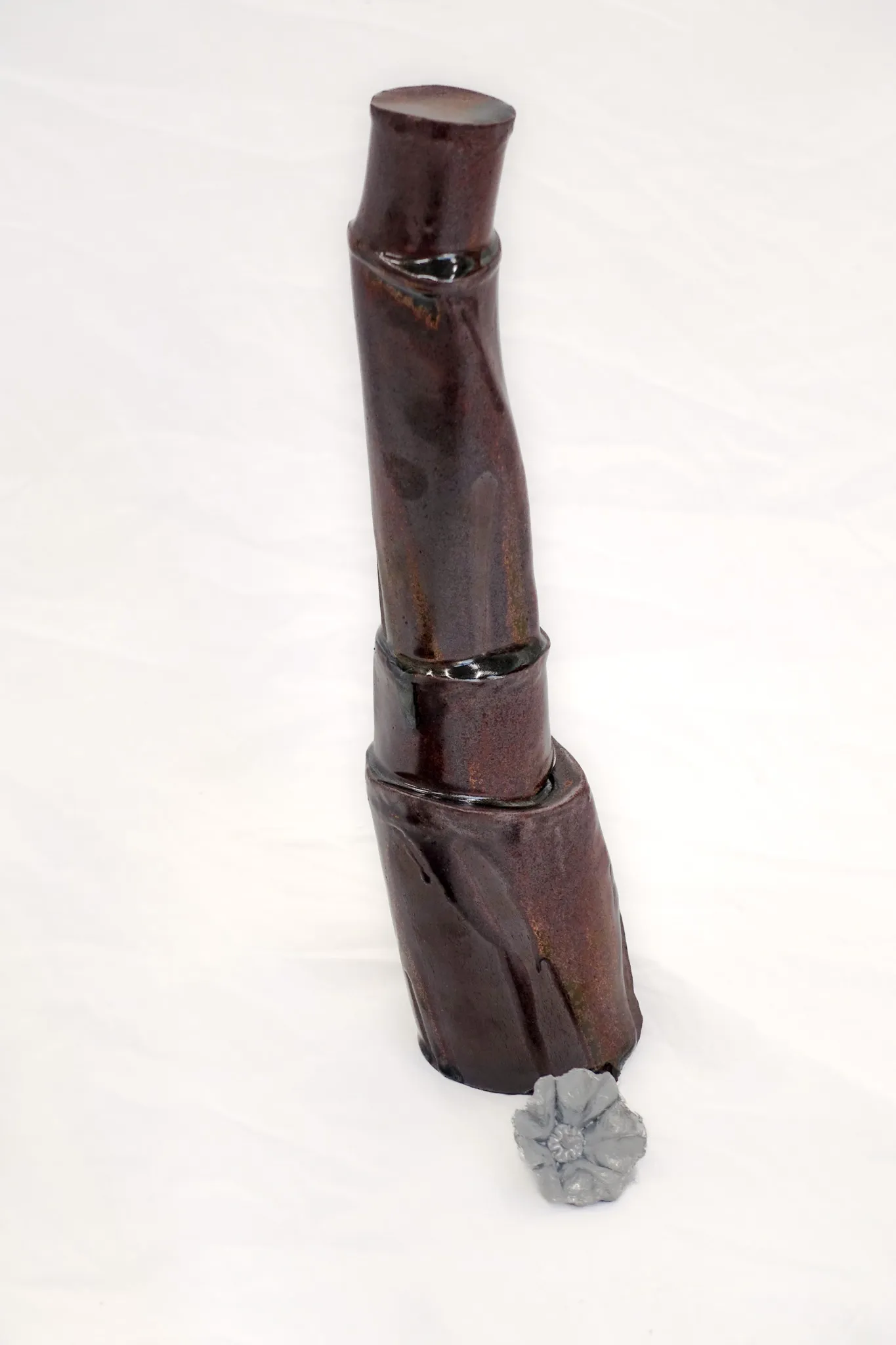
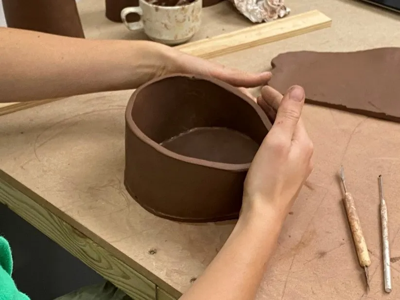
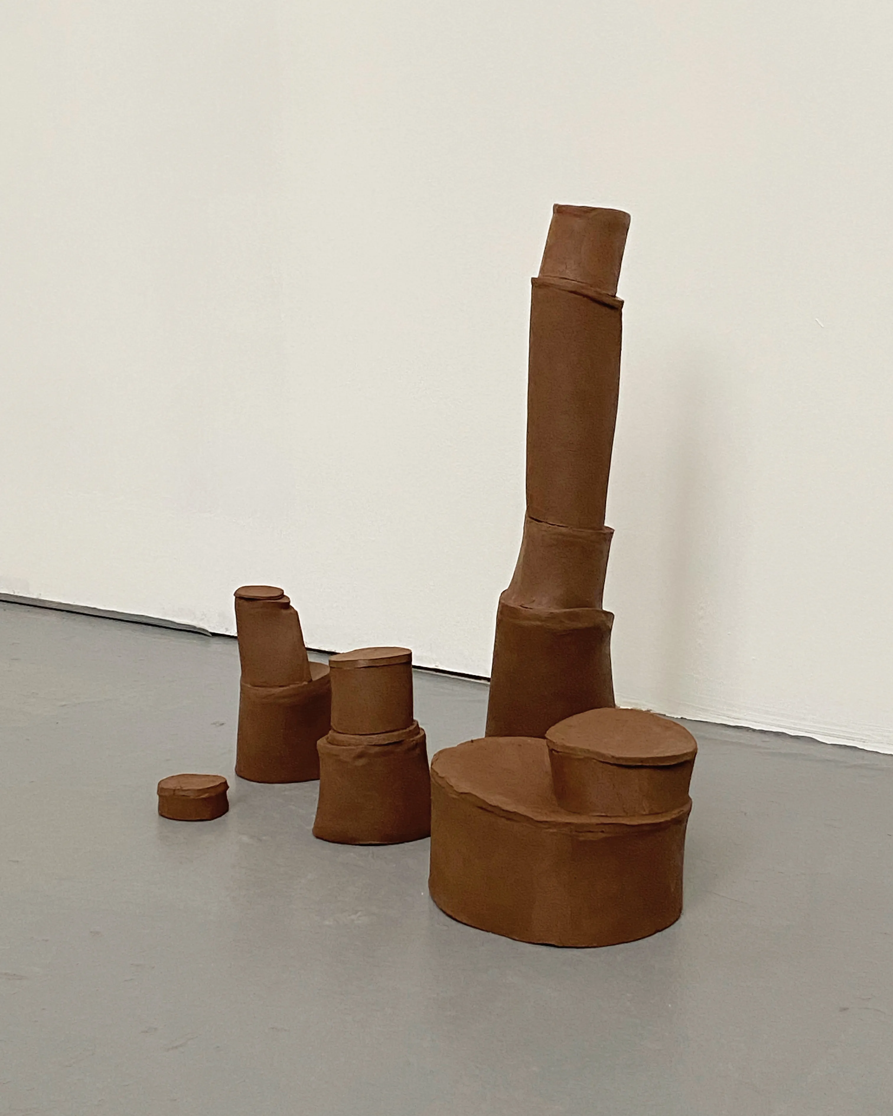
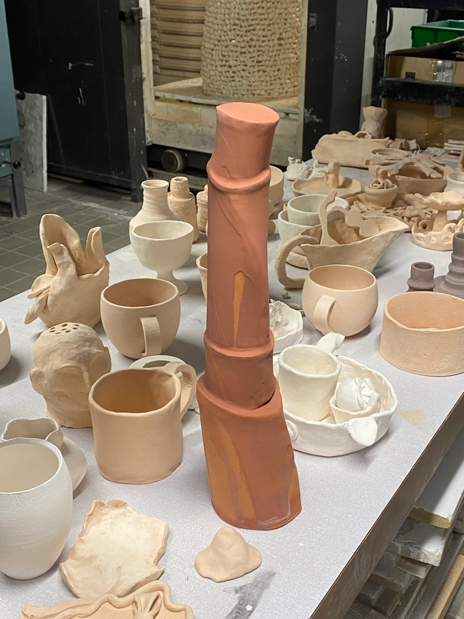
I thought working with clay slabs would be suitable to translate my drawings, as you could have real edges, like lines, a bit wonky but flowing. I also like that the material was malleable but could still collapse, so that if you place something on top and the clay sags, you could read the weight. In that way I felt it was quite honest, and interesting. I started with terracotta clay, as it’s the cheapest and softest, and easiest to work with. I was quite happy with them when I just made them, unfired, quite rough and raw. They definetely worked in group. But I felt I was missing one element. It didn’t really work to make the final shape that lies on top of the others in clay.
At the same time as trying to explore clay, I started taking interest in these flowers I found in my garden. I thought they could be the final element in this sculpture. A heavy body, building blocks stacked on top of each other, almost falling over due to their own weight, all to hold up the lightest and most delicate of materials: a flower. A heavy processed solid body, to hold an ephemeral object. I thought that could be something interesting, and could create the tension and fragility that I was missing at this point.
Flowers only bloom in summer and spring. If I wanted to preserve them, what material would be ‘honest’, what material would be appropriate to ‘catch’ them? I thought aluminium could work.
A whole other journey into materials started, which you can read
Glazing: material dishonesty?
After firing the raw terracotta pieces, the material was extremely disapointing. They looked like badly made ceramic objects. I could not imagine anything fragile or beautiful ever growing out of these objects. Maybe a glaze could puch them into another realm of materiality that is not so directly associated with terracotta. But I felt extremely uncomfortable thinking about glazing, because it meant I had to choose a colour. My idea of ‘material honesty’ was that the work should flow from the material, and by adding a glaze, a colour, to it, it felt too much like a personal choice loose from the material. And even more problematic, intuitively I thought about glazing them white.
Why white? The white that makes the art world so abstract and elite. I had all these connotations in my head with white that were very problematic.
I had a conversation with my classmates about this, and they advised me that I shouldn’t worry and that I should just try some different glazes, and see what they would to the sculpture.
So I went into the studio and had a look at the glazes. I found a white one, which it thought I could try just to rule it out probably. I also found a sample of a very nice Japanese ‘Tenroku’ dark red glaze on a reduction fired terracotta sample. I was quite drawn to the reduction fired terracotta. It turns into a very earthy purple, and feels hard. You don’t immediately associate it with pots. Because of a reduced oxygen flow in the kiln, the glazes react differently and quite often turn into a more metallic shade. I used a pouring technique to put the glaze on, and tried to keep some of the clay surface unglazed, as well as having different layers of glaze with drops running down. This in principle to being ‘honest’, accentuating the liquidity of the glaze: running down on longer vertical parts, and creating puddles on the more horizontal planes.
Result: in progress...
I’m not sure what to think of the result. The glaze is nice, the object is fine, but I don’t really feel the connection to it. In combination with the aluminium flower, it feels quite hard, quite man-made. It’s neither fragile nor poetic.
For now I think I will leave clay for what it is...